DRAWING LIFE by fred hatt

2012/07/04

Different Strokes

Porcupine, 1951, woodcut by Leonard Baskin


The magic of drawing or printmaking is in the strokes.  By strokes I mean the particular and idiosyncratic quality of the lines or other marks the artist makes.  Some lines jab while others meander.  Some markings are cloudy while others are crisp.  The strokes convey in a tactile way the essence of how the artist comes to grips with the challenge of capturing a thing seen or actualizing an inner vision.  Making a drawing is a journey of exploration, and these markings are the spoor of the trek.  When we look at a drawing, we can feel the energy that went into it in the particular flavor of its lineaments.

In this post I present a goodly selection of mostly monochrome sketches and prints by a wide diversity of masterly mark-makers.  I’ll let the works speak for themselves and leave it to you to contemplate the contrasts among them.  I have generally chosen pieces with a direct, spontaneous quality, avoiding highly finished styles where the quality of line may be more a matter of design than of the energy of the mind and the hand.  I often tried to find unfamiliar examples of the work of well-known artists, and sometimes individual works that are not representative of the artists’ familiar styles.  I think you’ll be particularly surprised by the early De Kooning sketch!

Man Walking in a Field, 1883, conte crayon drawing by Georges Seurat


Portrait, title, date and medium unknown, by Paul Cadmus


Composition, 1916, medium unknown, by Wassily Kandinsky


Edward Scissorhands, 1990, pen and pencil drawing by Tim Burton


Autumn, 1970, engraving by Salvador Dalí


Self Portrait, 1946, by David Alfaro Siqueiros


Musician portrait, date, title, and medium unknown, by Edgar Degas


Drawings, 1939, title and medium unknown, by Jackson Pollock


Saturn, 1516, engraving(?) by Hans Baldung Grien


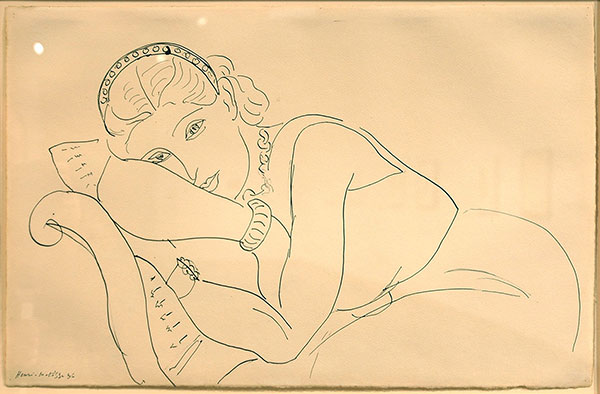
Resting Woman Wearing Tiara, 1936, pen and ink drawing by Henri Matisse


Sketchbook pages, date unknown, drawings by R. Crumb


Reproduction Drawing III (after the Leonardo cartoon), 2010, media unknown, by Jenny Saville


Self Portrait at the Age of Eighty-Three, 1843, ink brush drawing by Hokusai


Untitled, 1981, drawing by Jean-Michel Basquiat


Study for the Head of Leda, 1506, ink and chalk drawing by Leonardo da Vinci


Gregory Hines, date and medium unknown, sketch by Jules Feiffer


Study of the Head of Elizabeth Siddal for “Ophelia”, 1852, medium unknown, by John Everett Millais


Femme nue couchée, 1932, charcoal drawing by Pablo Picasso


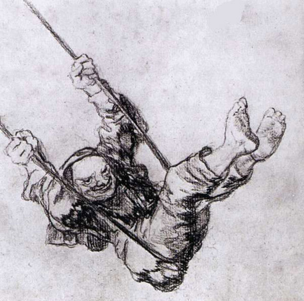
Old Man on a Swing, 1826, medium unknown, by Francisco Goya


Untitled, 1950, ink drawing on parchment by Philip Guston


Europa, 1953, lithograph by Hans Erni


Portrait of the Artist’s Mother, 1514, by Albrecht Dürer


Love Forever (TAOW), 2004, marker drawing on canvas by Yayoi Kusama


Bird Personage, date and medium unknown, by Remedios Varo


Court Room Scene, date and medium unknown, by Honoré Daumier


Beekeepers, 1568, etching(?) by Pieter Bruegel the Elder


Drawings, dates, titles and media unknown, by Alberto Giacometti


Self Portrait, date and medium unknown, by Henry Fuseli


Tree with Trunk, 1998, etching by Louise Bourgeois


Drawing, 1944, title and medium unknown, by Pavel Tchelitchew


Nude Study, 1908, etching by Georges Braque


The Sower, 1888, pencil and pen and ink drawing by Vincent van Gogh


Portrait of Elaine De Kooning, 1940, pencil drawing by Willem De Kooning


Some Can Fly and Some Can’t, 1939, medium unknown, by Rico Lebrun


Le Chapeau-Main, 1947, lithograph by Hans Bellmer


Sketch for “Apollo Slays Python”, 1850, medium unknown, drawing by Eugène Delacroix


Madame Louis-Francois Godinot, 1829, medium unknown, drawing by Jean Auguste Dominique Ingres, with detail


Corps de Dame, 1950, medium unknown, by Jean Dubuffet


Cape Lion, 1650, medium unknown, drawing by Rembrandt van Rijn


The Man who Taught Blake Painting in his Dreams, 1820, print(?) by William Blake


Five Swearing, 1912, oil sketch by Ferdinand Hodler


Madame Sohn, 1918, charcoal sketch by Egon Schiele


Seated Bodhidharma, 18th century, ink brush drawing by Suio Genro


All the images used in this post were found on the web, and clicking on an image will take you to the page where I found it.  Any information about the artwork that is listed as “unknown” is information I was not able to find at the time of making the post.  If you can provide additional or corrected information I will incorporate it.

Readers are invited to nominate some of their favorite drawings for an eventual sequel to this post!

2011/07/26

Freudian Analysis

Double Portrait, 1986, by Lucian Freud

Lucian Freud, who just died on July 20, 2011, devoted his long career to painting figures and portraits from life, perfectly ignoring all the art-world trends of his era.

Bella, 1987, by Lucian Freud

Many of his images are of people and/or animals sleeping.  He always painted directly from live models, often friends or family members rather than professionals, and he worked very slowly, so the sleeping poses may be an accommodation to the models.  I am struck, though, by the sense of struggle and intensity in these works.  Freud’s paint has the writhing quality of Goya’s horrors or El Greco’s spiritual transports, but in pictures of people simply relaxing on beds and sofas.  I think the sense of agitation arises from Freud’s own restless struggle to see more deeply and to capture in paint the intensity of his own visual experience.  For Freud, every canvas was a wrestling match against a powerful foe.

Pregnant Girl, 1961, by Lucian Freud

The fleshiness of his painting can be a distraction.  I got a better understanding of  the energy of Freud’s searching eye by looking at his etchings, where the quality of movement stands out.  Most portraitists view their sitters across a distance.  Freud’s perceptual focus hikes over his subjects like a surveyor mapping a territory.  He treats the figure as a landscape, to be explored by touch and movement.

Head and Shoulders, 1982, etching by Lucian Freud

Freud loved animals, and he often shows his own dogs posing with his models.  He told William Feaver, who wrote a book about Freud’s work, “I’m really interested in people as animals.  Part of my liking to work from them naked is for that reason.  Because I can see more, and it’s also very exciting to see the forms repeating through the body and often the head as well.  I like people to look as natural and as physically at ease as animals, as Pluto my whippet.”

Sunny Morning - Eight Legs, 1997, by Lucian Freud

Lucian Freud was the grandson of Sigmund Freud, the progenitor of psychoanalysis.  Sigmund Freud spent hundreds of hours with his subjects lying on a couch, trying to penetrate the hidden recesses of the mind through dreams and free association.  Lucian Freud also spent hundreds of hours with his subjects lying on a couch, but he kept an intense focus on the surface.  I think he felt that the physical body, truly seen, could reveal hidden depths.  Surely Lucian Freud’s work reveals depths, although, as with Sigmund’s work, it could be argued that those depths belong to Freud more than they do to his subjects.

David Hockney; Lucian Freud, 2003, photo by David Dawson

Freud said, “My work is purely autobiographical… It is about myself and my surroundings. I work from people that interest me and that I care about, in rooms that I know.”  Given the necessity of spending a great deal of time with his sitters, he wouldn’t work with anyone unless he genuinely liked that person.  Still, he absolutely avoided any sentimentality or idealization.  Freud’s subjects had to accept that he would portray their every flaw, that he would reveal their mortality.

David Hockney, 2003, by Lucian Freud

While Freud, as far as I know, never worked from photographs, some of his models were photographed while posing for his paintings, which gives us an excellent way of seeing where he exaggerates and what he emphasizes.

Sue Tilley posing for Lucian Freud, 1995, photo by Bruce Bernard

Benefits Supervisor Sleeping, 1995, by Lucian Freud

The painting above is one of Freud’s best-known works, having set a record for the highest price paid for a painting by a living artist when it was sold at Christie’s in 2008 for 33.6 million dollars.  Notice how much older the model appears in the painting than in the photograph.  He seems to have made her more obese and more splotchy.

Many figurative painters do the opposite, omitting bruises and calluses and visible veins, subtly idealizing the body.  And many people are repelled by Freud’s figures, with their sexuality and mortality so blatantly on display.  Speaking for myself, this is the very aspect of Freud’s work that gives it spiritual power.  It is the essence of the human condition that we are spiritual beings manifested in animal bodies that experience fear and desire, suffering and decay.  I see this as the quality of art that Federico Garcia Lorca calls duende, the life force intensified by the closeness of death.

Naked Man with Rat, 1977, by Lucian Freud

Freud’s earlier work, such as the portrait below of Lady Caroline Blackwood, lacks the blotchy impasto of his later work, but there is already a kind of magical realism, with enlarged eyes and expressive distortions.

Girl in Bed, 1952, by Lucian Freud

Freud said, “The longer you look at an object, the more abstract it becomes, and, ironically, the more real.”  You can see this principle not only in the individual works, but across the artist’s entire oeuvre.  The later work is unquestionably more abstract, the strokes wilder and freer, but they also have a living presence that is much stronger than in the earlier work.

Four Figures, 1991, etching by Lucian Freud


The Painter's Mother III, 1972, painting by Lucian Freud, and The Painter's Mother, 1982, etching by Lucian Freud

The face below is surely distorted, yet you can see the intensity of the artist’s perception in every thick stroke.  There is a kind of aura, a powerful presence that cannot be achieved by working from photographs and fretting over accuracy.

Esther, 1982, by Lucian Freud


Lucian Freud and model, 2004, photo by David Dawson

Freud said, “Perhaps when you have the sort of temperament that is always looking for flaws and trouble it might stop you from having what you always want, which is to be as audacious as possible. One has to find the courage to keep on trying not to paint in a stale or predictable way.”

Night Portrait, 1978, by Lucian Freud

I’ll conclude this post with two of my favorite Freud nudes.  Night Portrait, above, finds beauty in a pose that seems to be both resting and running, and in the textural contrast between the body and the quilt.  Naked Man, Back View, one of Freud’s many paintings of the model Leigh Bowery, also well known as a performance artist and costume designer, suggests an interior life through the turned-away display of a mountainous back.

Naked Man, Back View, 1992, by Lucian Freud

All the images in this post were found on the web.  Clicking on the pictures links to the pages where I found them.  The Lucian Freud quotes were also found on the web.  All the quote sites seem to have a similar collection of Freud quotes, unfortunately not sourced.

2011/01/12

Mixing in the Eye

Alley, 2009, by Fred Hatt

Most contemporary technologies of color image reproduction use optical mixing to obtain a full range of colors.  Four-color process printing, CRT, LCD and plasma displays, all reproduce a wide gamut of hues and values using tiny dots of ink or luminous pixels in just three or four colors.  The colors remain discrete in the image, and are only blended in the eye.  The illustration below shows a detail of a printed color picture, with inks of cyan, magenta, yellow and black in dots of variable size.  A color monitor performs a similar trick with glowing red, green and blue dots of variable brightness.

Image printed in four-color process, with detail showing halftone dots

The old masters who developed the craft of pictorial oil painting did not, as far as I know, ever consciously use the phenomenon of optical color mixing.  Most of them used some variation of the technique of grisaille, or painting in black and white (or sometimes in greens or earth tones), then adding color by applying thin transparent glazes over this monochrome foundation.  Jan Van Eyck is often considered the first master of this technique, and it’s still commonly used by painters who follow the classical methods.  Here are two versions of a painting by Jean Auguste Dominique Ingres, the first version in grisaille, and the second with color glazes applied.

Odalisque in Grisaille, 1824-34, by Jean Auguste Dominique Ingres

Grande Odalisque, 1814, by Jean Auguste Dominique Ingres

The great virtue of this method is to achieve a feeling of solidity and luminosity.  The grisaille painting allows for a sculptural rendition of values, and the white of the grisaille reflects all wavelengths of light, which are then subtly filtered by the glazes.  Light penetrates the transparent surface layer of the painting and reflects back to us from a deeper level, tinged as the setting sun or the distant mountain are tinged by the intervening atmosphere.

Directly mixing pigments on the palette or on the canvas, on the other hand, tends to give dull and flat colors.  Every opaque blend of two pigments has less brightness and less intensity of color than either of its components.  The natural mineral pigments available to painters before the industrial revolution were extremely limited, so the glazing technique was often the only way to achieve color that was both vivid and subtle in its gradations.

In the nineteenth century, several technological innovations led to a completely new approach to color in painting.  Photography quickly surpassed the painters in its ability to render monochromatic values.  This made painters strive to reproduce the more vibrant effects of color that photography still could not capture.  Modern industrial chemistry discovered new synthetic pigments that were both permanent and far more vivid than the classical artists’ pigments.  All those paints with chemical sounding names like alizarin and phthalocyanine are products of the new chemistry.  Pre-mixed paints in squeezable metal tubes were yet another nineteenth century development that made it much easier for an artist to leave the studio and study the colors of nature and the effects of light outdoors, or en plein air.

French Impressionism was the product of all these changes.  The old methods started to seem stodgy and lacking in spontaneity, and in any case were unsuited to plein air painting.  You can observe optical color mixing effects starting from the beginnings of the impressionist movement, as in this Renoir painting.

Bal au Moulin de la Galette, 1876, by Pierre-Auguste Renoir

In the detail below, you can see that the clothing and shadows on the ground are painted with various bright colors in close proximity, colors that do not correspond with the actual surface colors of the objects being depicted.  The overall impression of the colors in the painting is vibrant but not unnatural.

Bal au Moulin de la Galette, 1876, by Pierre-Auguste Renoir, detail

Monet painted haystacks in a field and the facade of Rouen Cathedral over and over again, trying to capture the ever-changing subtleties of light and air.  [Both links in the preceding sentence are well worth a click!]  Here the haystack contains dabs of red, olive, lavender, violet and black.

Grainstack (Sunset), 1890-91, by Claude Monet

Artists such as Edgar Degas and Mary Cassatt used optical mixes of odd colors like greens and purples to depict flesh tones.

Lydia Leaning on her Arms, Seated in a Loge, 1879, by Mary Cassatt

George Seurat studied the science of color perception, and developed an analytical approach to painting with optically mixing colors.  He called his method chromoluminarism, though it’s better known today as pointillism, a word originally coined by critics.  Here’s one of his mural-scale canvases, followed by a detail of a face in profile, showing the discrete dots of color.

La Parade du Cirque (Invitation to the Sideshow), 1889, by George Seurat

La Parade du Cirque (Invitation to the Sideshow), 1889, by George Seurat, detail

What Seurat does with analytical coolness, Vincent van Gogh does with fiery intensity.

Sower with Setting Sun, 1888, by Vincent van Gogh

Optical mixing of colors also interested abstract expressionists such as Joan Mitchell.

Weeds, 1976, by Joan Mitchell

Chuck Close is the heir to Seurat’s analytical approach, as in this monumental self-portrait.

Self Portrait, 1997, by Chuck Close

Self Portrait, 1997, by Chuck Close, detail

For my own work in color, I usually use aquarelle crayons on toothy charcoal paper.  The crayons deposit bits of pigmented wax on the ridges of the paper.  Going over an area with more than one color leaves the markings separate, and the colors mix optically.  Here’s a detail of the portrait of Alley featured at the top of this post.  You can see that the flesh tones are made up of strokes of blue gray, pink, yellow, light blue, reddish brown and white, on a neutral gray paper.  The technique is particularly effective at depicting reflected light in shadow areas.

Alley, 2009, by Fred Hatt, detail

Here’s a quicker figure sketch, followed by an enlarged detail.  Here the colors making up the flesh tones include turquoise, orange, fuschia, and yellow.

Maira Horizontal, 2010, by Fred Hatt

Maira Horizontal, 2010, by Fred Hatt, detail

Mixing colors in the eye, rather than on the palette, produces color impressions that are bright and shimmery, that suggest not only the effects of light but the slippery nature of flesh tones.  The actual colors of living human skin are subtle to the point of elusiveness.  Skin is translucent, imbued with underlying colors of blood and fat.  Its surface is nearly iridescent, and reflects and refracts the colors of surrounding objects and lights.  Flat colors cannot capture this subtlety.  Grisaille and glazing can, and so can optical mixing, in a very different way.

All the images in this post, besides those of my own work, were found on the web.  Clicking on the pictures will take you to their source pages, and in many cases, to larger versions of the images.

2010/09/26

End-On: Extreme Foreshortening

Filed under: Figure Drawing: Poses,Top Ten — Tags: , , , , , — fred @ 23:18

Dynamo, 2010, by Fred Hatt

My friend, model/muse and blogging mentor Claudia likes to post photos of herself to celebrate the anniversaries (first, second, third) of the launching of her great blog, Museworthy, and it has been my honor to be the chosen photographer each year so far.  This year we were seeking a new approach.  Claudia had the idea of getting in low and close with the camera, treating the body as a landscape.  She chose this sensual abstraction for this year’s anniversary post.

I love seeing the body this way.  Unusual angles create perspective effects and unfamiliar juxtapositions, and utterly transform the familiar forms of the body.  Foreshortening is a fundamental concept in drawing, designating the distortion of long shapes when seen end-on.  Often, in figure drawing, this refers only to an arm or leg that appears pointed toward the viewer of the image.  A familiar example would be the pointing finger and arm of Uncle Sam in James Montgomery Flagg’s iconic army recruiting poster of 1917.  Here I post examples of my figure drawings in which not only the extremities but the entire body is seen from a foreshortened perspective.

Looking at the body from an angle close to the central axis is very helpful in understanding it as a three dimensional form.  In these foreshortened torsos, we see the protuberances of the iliac spine of the pelvis rising to either side of the pubic bone.  The abdomen is a saddle-like shape, concave in one direction and convex in the other.  The ribcage is a converging arch.  The pectoral or breast muscles show a continuity with the deltoid muscles of the shoulder.  The upper of these drawings still shows analytical lines I drew to figure out the angular relationships of bodily landmarks.

Surveyed, 2004, by Fred Hatt

Thorax, 2009, by Fred Hatt

Looking at the body from the head end shows a succession of rounded or symmetrically swelling forms:  the top of the skull, then the cheekbones and nose, the jaw, the collarbone, the shoulders, the chest, the ribs, the abdomen and pelvis.  You can see it as a kind of architecture based on a series of differently shaped arches that you pass through or over, or as a landscape of hills and valleys that you can traverse on a meandering trail.  From this angle the legs and feet are often severely forshortened, and are best observed in relation to the cross-sectional contours of the torso.

Lounging, 2000, by Fred Hatt

Head End 2, 2006, by Fred Hatt

Head End, 2006, by Fred Hatt

I try to see organic physical forms as manifestations of patterns of energy.  In looking down the length of the body, you can see each of these levels as manifestations of the elemental forces associated with the chakras, a series of focal points arranged along the central column of the body in a Yogic conception of energy anatomy.  For example, the pelvis, corresponding to the water element, has the form of a basin, while the chest, corresponding with the air element, has the form of a bellows.  Here are a few sketches from a series exploring the energy patterns of the body in this context:

Strata, 2002, by Fred Hatt

Flat, 2002, by Fred Hatt

Zones 1, 2002, by Fred Hatt

To see the body in extreme foreshortening, I find it helpful to look at it not in terms of an understanding of structural relationships and proportions, but cross-sectionally, as a series of transverse contours receding in space.  The National Library of Medicine’s Visible Human Project, a three-dimensional atlas of human anatomy, has a website that offers animated “fly-throughs” of the human body in the various planes of sectioning.  Here’s the transverse section animation, the one most relevant to these end-on views of the human body.

Here are some more of my compositions of the body in extreme foreshortening:

Crossed Ankles, 2004, by Fred Hatt

Nuit, 1999, by Fred Hatt

The examples above are drawn from a distance of at least three meters and so show a sort of compressed perspective.  The feet and head are roughly in the same proportional scale but the angle of view has caused things to be seen in unfamiliar juxtaposition.  The drawing below is drawn from much closer, so it shows more perspectival diminution.  The feet and legs, closer to me, are large in comparison to the upper body and head, which are further away.  The length of the foot, measured on the drawing, is more than twice the width of the skull, but it looks right because it represents the perception of perspective.

Perspective, 2010, by Fred Hatt

In this foot-end view, the angles of the feet and legs are the foreground of the drawing, while the upper body becomes the mountain on the horizon.

Side Drawn Up, 2001, by Fred Hatt

Prone Reach, 2006, by Fred Hatt

Splay, 1999, by Fred Hatt

When the head is the foreground element, it remains abstract as we are looking at the top of the skull, and the face, if seen, is highly abstracted.  The body is even more landscape-like seen from the head end.

Climber, 2006, by Fred Hatt

In the drawing below, the blue line in the background is the “horizon”, or edge of the floor on which the model was lying.  The body formed a tilted rectangular form, so I tilted my drawing board to maximize usage of the page.

Tilted Horizon, 2001, by Fred Hatt

Sometimes these end-on views become visions of pure organic form.

Prone Twist, 2009, by Fred Hatt

The twisting of the body, as seen in the example above, also creates interesting sculptural forms seen from the foot end.

Corner, 2010, by Fred Hatt

Here the legs go one direction and the head the opposite, with the hand and arm reflecting that arc of movement.

Helix, 2001, by Fred Hatt

Here the position of the legs gives a soft curve to one side of the figure and a sharp angle to the other.

Bow and Arrow, 2000, by Fred Hatt

When the body is visually compressed by foreshortening, an upraised knee becomes dramatically long and vertical by contrast.

Wrist to Knee, 2008, by Fred Hatt

Angular Recline, 1998, by Fred Hatt

In the drawing below, the use of a mirror gives a view of the same pose from both the head end and the foot end.

Mira, 1996, by Fred Hatt

I’ll close this collection with a more finished piece, a foreshortened figure of graceful serenity.

Tranquility, 2008, by Fred Hatt

All the drawings in this post are aquarelle crayon on paper, in the size range of 18″ x 24″ to 20″ x 30″.  Other examples of foreshortened figures can be seen in this post and this one, and there are many others scattered through my portfolio site and other figure drawing posts on this blog.  This post features a famous 15th century foreshortened figure painting by Andrea Mantegna.

If you’re a student of drawing, you might be interested in a new series of articles on learning the basics of drawing that has begun appearing in the Opinion pages of the New York Times online edition, under the title “Line by Line” by James McMullan.

2010/03/23

Drawing as Theater / Presence as Provocation: Kentridge and Abramovic at MoMA

Rest Energy, photo of a 1980 performance by Marina Abramovic and Ulay, photo from Galleria Lia Rumma

The Museum of Modern Art in New York currently hosts retrospectives of two idiosyncratic and uncompromising living artists, Yugoslavian born Marina Abramovic and South African William Kentridge.  The two artists could hardly be more different from each other, but each has followed the path of art as something deeply personal and necessary.

Marina Abramovic emerged as a performance artist in the 1970’s.  Using her own body as her medium, she explored the power of living presence in ritual acts of vulnerability and endurance.  Her earliest works were so raw and risky they still shock – for example, in Rhythm 2 (1974), she took drugs that caused seizures, convulsions and catatonia.  But then in the 70’s everyone was experimenting with drugs – she just did it in front of an audience.

In 1976 she began a twelve year collaboration with Ulay (Uwe Laysiepen).  The work they did together achieved a kind of spiritual and aesthetic clarity that has not been surpassed, even as this kind of work has entered the mainstream with David Blaine‘s well-publicized acts of endurance.  In “Rest Energy”, pictured at the top of the post, Abramovic and Ulay lean apart, their weight suspended by the tension of a bowstring with an arrow aimed at Abramovic’s heart.

Abramovic and Ulay traveled continuously, living in an old Citroen van (the van is in the MoMA exhibit), fully devoting their lives to their artistic experiment.  A statement they wrote at the time (1975) reads:

ART VITAL

no fixed living-place
permanent movement
direct contact
local relation
self-selection
passing limitations
taking risks
mobile energy
no rehearsals
no predicted end
no repetition
extended vulnerability
exposure to chance
primary reactions

Abramovic and Ulay parted ways in 1988.  Much of Abramovic’s solo work from the 90’s looks to me more strident and more self-conscious about making “statements”, but in her most recent work she seems to be rediscovering the power of simplicity.

The Abramovic retrospective at MoMA includes documentation of a great many of these performances that tested the limits of the mind and body and the relationship between artist and audience.  It also includes living “reperformers”, re-enacting several of the most well-known actions.  The one that has been most widely discussed is Imponderabilia, originally performed by Abramovic and Ulay in 1977.  A naked male and female stand impassively facing each other in a narrow doorway, through which museumgoers may pass only by squeezing sideways between the pair.

Abramovic has long argued that performance art must be kept alive by reperformance, and in her 2005 show at the Guggenheim Museum she herself reperformed a number of seminal performance works originally done decades ago by such artists as Joseph Beuys and Valie Export.  It is undeniable that the MoMA show is more interesting with live bodies interspersed among the old documentation, but the change of context has surely altered the effect of the pieces.  It is not just that what were once radical experiments are now enshrined in the most institutional of museums.  The original pieces were radically minimalist – highly clarified simple happenings in isolation, usually presented in blank gallery spaces.  The MoMA exhibit is like a crowded menagerie of acts and images, with a steady flow of tourists trying to see it all before their feet give out or the kids start crying or they have to meet someone for dinner.

The title of the Abramovic show at MoMA is The Artist Is Present, and it is with her own simple presence that she makes the strongest statement and the deepest impression in this show.  In the great atrium of the Museum, throughout the public hours while her exhibit is open, the 63-year-old artist sits silently at a table, while museumgoers are invited to sit directly across from her.  She sits all day, and will do so for 77 days.  This is about as radically minimal as performance can get.  She is not doing anything sensational, really not doing anything at all.  But if you’ve tried to sit still for even an hour you know it becomes incredibly grueling.  You can often see the pain in her face as she holds steady eye contact with an endless stream of museum visitors, some of whom sit for moments, and some for hours.  It is an act of extreme endurance, but also, in a way, an act of extreme generosity, giving herself to her audience in direct human presence.  Observe for a while and you’ll see suffering, defiance, confrontation, resignation, engagement, boredom and bliss – the full range of the human condition living and breathing there before us.  Amazingly, her simple presence fills up the gigantic atrium space more than any of the monumental pieces of art I’ve seen there over the years.

On the opening day, her former collaborator, Ulay, showed up at the table for an unexpected tearful reunion:

Ulay and Marina Abramovic, March, 2010, photo by Scott Rudd for MoMA

Just off the Atrium is the entrance to another immersive exhibit, William Kentridge:  Five Themes.  Timed to coincide with Kentridge’s multimedia staging of Shostakovich’s opera The Nose (based on Nikolai Gogol’s short story) at the Metropolitan Opera, this retrospective shows Kentridge’s drawings, prints, animated films, theatrical designs, optical experiments and even animatronic puppets as a diverse but highly unified body of work that spans media and obliterates the traditional line dividing graphic art and theatrical storytelling.

Kentridge became widely known in the 1990’s for his 9 Drawings for Projection (1989-2003), a series of richly evocative short animated films, made by drawing, erasing and redrawing large charcoal sketches on paper.  Originally shown one at a time in galleries in conjuction with exhibits of the final-stage charcoal drawings, the series of films hangs loosely together as a single ongoing story.  They tell of an industrialist, Soho Eckstein, his wife, and her lover, the bohemian Felix Teitlebaum, who is always depicted naked.  Eckstein and Teitlebaum are opposites in a way, but both recognizably resemble Kentridge.  The story in 9 Drawings plays out across the backdrop of the upheavals of South Africa in the late apartheid and early post-apartheid eras, but the films aren’t straightforwardly political.  Instead they’re personal and poetic.  The erasures and redrawing of the filmmaking technique, the transformations of the elemental and mechanical imagery, the ebb and flow of the lives of the characters, and the shifting sands of cultural change are all of a piece, an era of life experience distilled into a cinematic dream.  I get the impression that the transformations of the drawings are not preconceived, but exploratory.
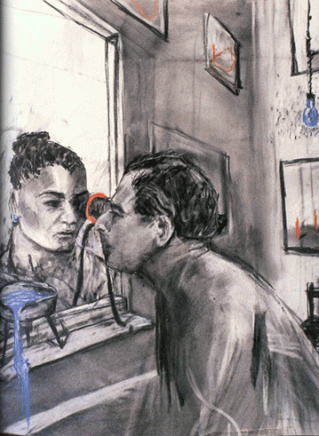
Drawing from “Felix in Exile”, 1994, one of “9 Drawings for Projection” by William Kentridge

The museum show is arranged not chronologically or by media, but thematically.  The 9 Drawings and other films are projected at monumental size, with the real drawings, also quite large, nearby, allowing one to experience the images in both their forms, as mutable projections and as the tactile reality of smudgy charcoal on heavily worked paper.

Kentridge is an obsessive drawer and mark-maker.  One room in the MoMA show surrounds us with multiple projections showing him drawing, tearing paper, pouring ink, etc., often in reverse.  Other rooms are filled with projections, drawings and objects based around designs for his recent operatic productions, Mozart’s Magic Flute and Shostakovich’s The Nose.  There is almost too much to take in, a barrage of images and ideas, nearly all in bold black and white, with a rough, handmade texture.  Throughout the exhibit there are many recurring images, including water and bathing, mechanically walking figures, birds and  rhinoceroses, the industrialized landscape, Alfred Jarry’s corrupt king Ubu, and especially Kentridge’s own heavyset self-image.

Kentridge’s work is not colorful, and while it is bold, it is not simplistic.  It is gray and ambiguous and conflicted.   It draws upon the angular dynamism of early-20th-century avant-garde design, but the boldness is more than anything else the magnified theatrical gesture of the human form.  This is the closest contemporary work I know to the great etchings of Goya, the Caprichos and the Disasters of War.  For Kentridge the act of drawing is theatrical, improvisational and demonstrative, and theater is a graphic art where shadows and lines convey ideas and feelings.

Drawing for II Sole 24 Ore (World Walking), 2007, by William Kentridge; Charcoal, gouache, pastel, and colored pencil on paper, Marion Goodman Gallery

I’ll close with a quote from the Phaidon Monograph, William Kentridge, by Carolyn Christov-Bakargiev et al, that reveals something about his open-ended creative process:

“Drawing for me is about fluidity.  There may be a vague sense of what you’re going to draw but things occur during the process that may modify, consolidate or shed doubts on what you know.  So drawing is a testing of ideas; a slow-motion version of thought.  It does not arrive instantly like a photograph. The uncertain and imprecise way of constructing a drawing is sometimes a model of how to construct meaning.  What ends in clarity does not begin that way.”

Marina Abramovic:  The Artist Is Present, organized by Klaus Biesenbach, Chief Curator at Large, The Museum of Modern Art, and Director, P.S.1 Contemporary Art Center, is on view through May 31, 2010, at the Museum of Modern Art, New York.

William Kentridge:  Five Themes, originally organized for the San Francisco Museum of Modern Art and the Norton Museum of Art by Mark Rosenthal, is on view through May 17, 2010 at the Museum of Modern Art, New York.

Images in this post link back to the sites where I found them.

Older Posts »

Powered by WordPress

Theme Tweaker by Unreal