Sky God, 2010, by Fred Hatt (detail)
Today, on Drawing Life’s fifth anniversary, I would like to invite you to an exhibition (details at the bottom of this post) and to ask the question, “Why is ‘drawing’ called that?

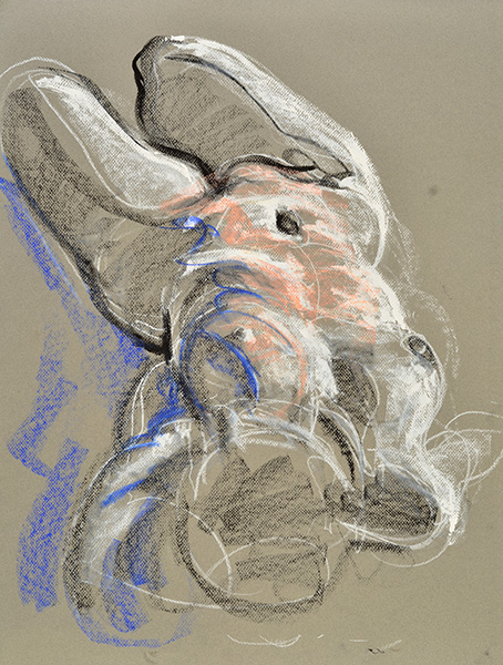
Serrate, 2008, by Fred Hatt (detail)
The word “draw” comes from Old English and Germanic terms describing various forms of pulling. Sometimes it’s draw, sometimes drag, draft, or the like.

Neon Creature, 2008, bodypaint and photo by Fred Hatt (detail)
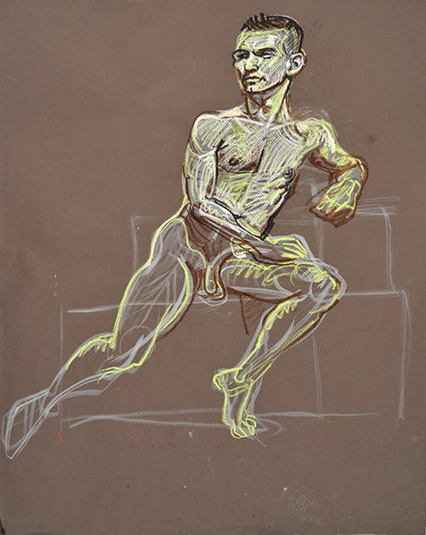
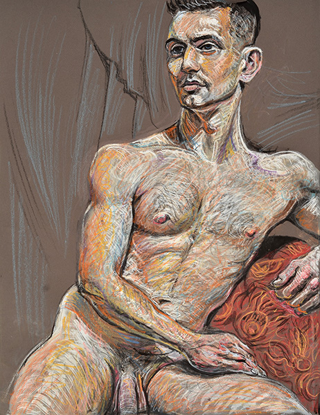
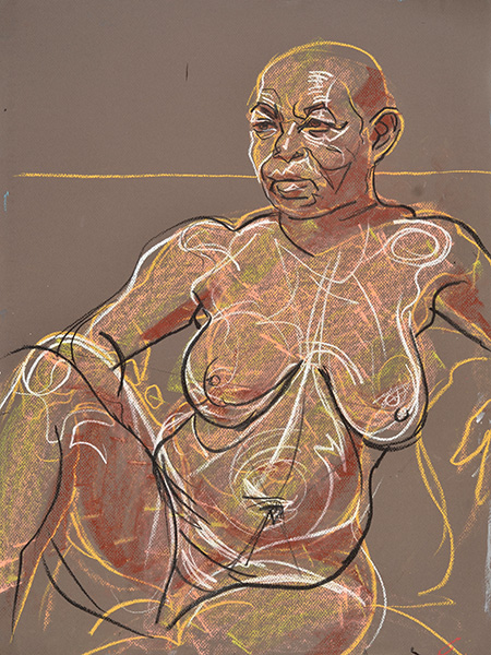
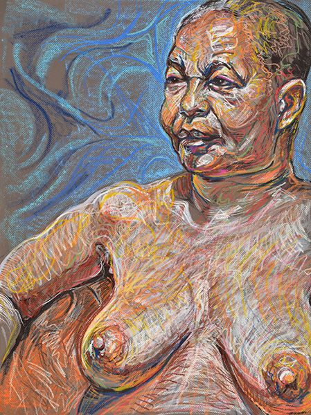
(Note: The illustrations between paragraphs are details of my artworks that have appeared in the past five years of Drawing Life. Clicking on the images will link you to the original posts containing uncropped versions of the works. An earlier post with similar detail crops is here.)

Mitchell 2, July, 2011, by Fred Hatt (detail)
We have phrases like draw back, draw forth, draw out, draw in, draw from, draw towards, draw up, draw down.

Street Grass, 2008, photo by Fred Hatt (detail)
An account can be overdrawn, a character in a play underdrawn, breath indrawn.

Torso Vessels, 2009, by Fred Hatt (detail)
You can draw a card, draw a gun, draw a conclusion, draw a crowd, draw a salary, draw a carriage, draw water, draw fire, draw a blank.

Waxing Moon, 2010, by Fred Hatt (detail)
Supposedly the reason we use the word for sketching, or for making pictures, is because we draw our charcoal (or other marker) across a page. But of course the hand engaged in such action is pushing as much as it is pulling.

The Active Mirror, 2003, drawing performance by Fred Hatt, detail of acetate drawing
Maybe if we called it “pushing” instead of “drawing”, we would think of this artform differently. But the sense of pulling seems right to me in myriad ways.

Earth, 1998, photo triptych by Fred Hatt (detail)
To draw observationally is to draw near to something, to study it as if you could pull its essence into you through your eyes. The artist draws inspiration from the subject. By having a subject or object of study the artist remains grounded in a living relational reality, drawing the spirit of life into the picture.

Vascular Tree, 2005, photo by Fred Hatt (detail)
To draw imaginatively is to draw images, entities, energies up from the unconscious. It is to find embryonic notions and incubate them, and to coax them out of the nest. It is to exaggerate, to extrapolate, to speculate, to reach into the well and draw up the water of potentiality, to make the unreal visible.

Connection, Healing Hands series, 2010, by Fred Hatt (detail)
To draw abstractly is to draw upon primeval attractive forces and the structures and processes that derive from them. It is to know hues and shades as pure qualia, to know marks and shapes as matter and energy, to know structures as harmonies.

Towering, 2012, 38″ x 50″, by Fred Hatt (detail)
To share one’s artwork with another person is to attract someone to you not with your looks but with your vision. Even the work of an artist long dead, if it be strong, brings some of those that experience the work close to the artist’s bosom or cranium. The audience is pulled into the artist’s way of experiencing the world.

Twixt, 2011, by Fred Hatt (detail)
Of course most of what I’m saying applies not just to drawing per se, but to any really great work of art, be it music or dance, storytelling or performing. Art is what draws us. It draws us out of ourselves, draws us to a new way of feeling. Art draws magical power out of humble, earthy materials. Art calls up the bright spirits and the dark spirits so that they dance for us. Art draws us in. It draws out the creative power that is hidden everywhere and in all. Inspiration means the drawing of breath. Our consumer culture is all about taking in. Drawing is taking in with acute high awareness.

Licking Flames, 2009, photo by Fred Hatt (detail)
Most of our contemporary arbiters of culture think of drawing as a subsidiary thing – a training practice like a musician’s scales, a quick and dirty throwaway tool like brainstorming with Post-It Notes, a messy way of working out a composition or concept, like a plot outline. They see drawing as sketchy, undeveloped, unsophisticated.

Soft Angles 5, 2009, by Fred Hatt (detail)
I contend that drawing is one of the very most basic forms of art, along with music and dance and performing and storytelling. I think it makes more sense to say painting, sculpture, and design are developments from drawing than vice versa, and so drawing must be considered more fundamental.

Adapt Festival 3, 2013, by Fred Hatt (detail)
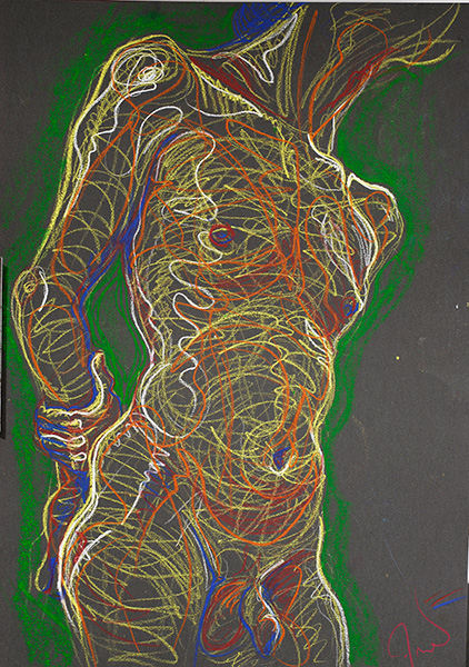
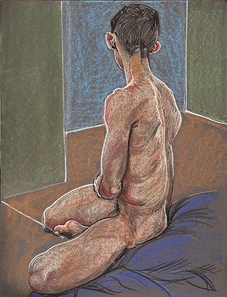
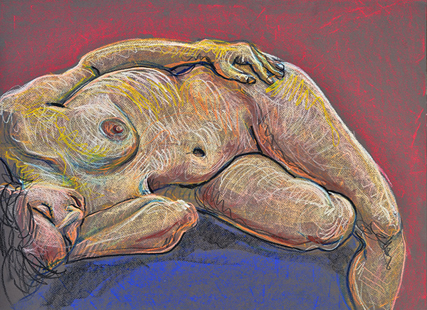
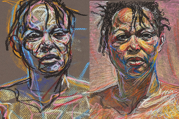
Those who have followed this blog over the years know that I work with photography, video, performance, body art. I think of drawing as the root of my practice, and the other forms as extensions or variations on drawing. The images accompanying this text are details of figure drawings, doodles, abstract paintings, photographs, and body art. For me they all have some quality in common – a quality that is the essence of drawing.

Window Display in Sunlight, 2010, photo by Fred Hatt (detail)
Where do you draw the line to define drawing as distinct from, say, painting? Wet media vs. dry? That doesn’t quite nail it. Some pastellists call their work paintings, while ink wash or watercolor sketchers may call their work drawings. Quick vs. developed? That doesn’t work either. There’s a fashion in the art world these days for painstakingly obsessive works using ink or pencil, works that may take longer to make than most paintings, and usually these get called drawings. My friend Lorrie Fredette, sculptor and installation artist, recently made a series of works using sutures, black and white threads sewn into sheets of paper, and she called these drawings. Not all drawings are linear, not all are monochromatic, not all are simple. If there is an essence that defines the art of drawing, it might be directness, or spontaneity, the distillation of energy in image.

Double Exposure, 2007, 30″ x 60″, by Fred Hatt (detail)
What do you call an artist whose primary focus is drawing? Draftsman? That sounds to me like someone who makes schematics and blueprints. Calligrapher? Graphic artist? Designer? Cartoonist? Sketcher? Delineator? Depicter? Tracer? Doodler? Those are all subsets of drawing. “Drawers” usually refers to either sliding storage compartments or underpants, so that doesn’t quite fit the bill either. I have seen some use the term “drawist”, but that seems to me an awkward construction. I think I will have to settle for calling myself a drawing artist.

Coral, 2011, doodle by Fred Hatt (detail)
If you are someone who draws, or who loves drawing, let me know in the comments section what drawing is all about for you.

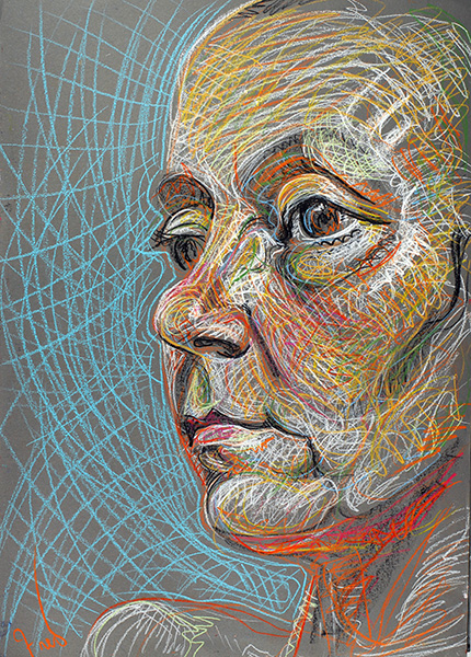
Henry, 2010, by Fred Hatt (detail)
If you’re in the D. C. area you can see one of my original drawings in the exhibition “Melange“, curated by Iurro, at Artspace 109, 109 N. Fairfax Street, Alexandria, Virginia.Artists in the show include Rachel Blier, Peter Bottger, Joren Lindholm, Scott McGee, Paul McGehee, Jitka Nesnidalova, Tea Oropiridze, George Tkabladze, and Tati Valle-Riestra. The opening is Sunday March 16, 3 to 6 PM. The show will be up March 18-May 10, 2014.