DRAWING LIFE by fred hatt

2013/12/09

Vowels

Barefoot, 2013, by Fred Hatt

Barefoot, 2013, by Fred Hatt

This post is an experiment. Some of my recent abstract watercolors, landscape sketches, and doodles have been randomly interspersed between the lines of Arthur Rimbaud’s synesthetic 1872 sonnet “Voyelles”. The original French poem and English translation by Oliver Bernard were copied from this site (where the fourteen-line sonnet is followed by a four-line “envoi” which is not included here below or in most versions of this poem I could find online). Oliver Bernard’s version is a prose translation, striving for the clearest expression of the sense of the original while sacrificing meter and musicality. If this version is too flat for you, check out Canadian poet Christian Bök’s fascinating version of “Voyelles”, translated five different ways.

These paintings were not inspired by this poem, and they have been sequenced randomly to avoid any specific reference to the colors or images mentioned in Rimbaud’s verses. When I draw or paint abstractly, I disengage my mind as much as possible from discursive thought and allow subconscious impulses to express themselves in the movement of the brush and the liquid medium. Imagery never drives the painting – any images are projections of the imagination, like the forms seen in Rorschach blots. I am trying to allow impulses of movement to arise from below the surface of awareness, as in my practice of Authentic Movement, described in this post. Perhaps this way of going fishing in the unconscious has something in common with the methods of a proto-surrealist poet like Rimbaud. Perhaps some accidental resonances may arise from the interleaving of sketches and lines of verse.  If not, please enjoy my humble doodles and Rimbaud’s delirious words separately!

Extinct Animals, 2013, by Fred Hatt

Extinct Animals, 2013, by Fred Hatt

A noir, E blanc, I rouge, U vert, O bleu: voyelles,

A Black, E white, I red, U green, O blue: vowels,

Pastries, 201e, by Fred Hatt

Pastries, 201e, by Fred Hatt

Je dirai quelque jour vos naissances latentes:

I shall tell, one day, of your mysterious origins:

Ego,m 2013, by Fred Hatt

Ego,m 2013, by Fred Hatt

A, noir corset velu des mouches éclatantes

A, black velvety jacket of brilliant flies

fredhatt-2013-autumn-wind

Autumn Wind, 2013, by Fred Hatt

Qui bombinent autour des puanteurs cruelles,

Which buzz around cruel smells,

Plant Spirit, 2013, by Fred Hatt

Plant Spirit, 2013, by Fred Hatt

Golfes d’ombre ; E, candeur des vapeurs et des tentes,

Gulfs of shadow; E, whiteness of vapours and of tents,

Path of Light, 2013, by Fred Hatt

Path of Light, 2013, by Fred Hatt

Lances des glaciers fiers, rois blancs, frissons d’ombelles;

Lances of proud glaciers, white kings, shivers of cow-parsley;

Pink Flowering Tree, 2013, by Fred Hatt

Pink Flowering Tree, 2013, by Fred Hatt

I, pourpres, sang craché, rire des lèvres belles

I, purples, spat blood, smile of beautiful lips

Electrical Storm, 2013, by Fred Hatt

Electrical Storm, 2013, by Fred Hatt

Dans la colère ou les ivresses pénitentes;

In anger or in the raptures of penitence;

Land Forms, 2013, by Fred Hatt

Land Forms, 2013, by Fred Hatt

U, cycles, vibrements divins des mers virides,

U, waves, divine shudderings of viridian seas,

Aromatic Tree, 2013, by Fred Hatt

Aromatic Tree, 2013, by Fred Hatt

Paix des pâtis semés d’animaux, paix des rides

The peace of pastures dotted with animals, the peace of the furrows

Mane, 2013, by Fred Hatt

Mane, 2013, by Fred Hatt

Que l’alchimie imprime aux grands fronts studieux;

Which alchemy prints on broad studious foreheads;

Green and Blue, 2013, by Fred Hatt

Green and Blue, 2013, by Fred Hatt

O, suprême Clairon plein des strideurs étranges,

O, sublime Trumpet full of strange piercing sounds,

Coral, 2013, by Fred Hatt

Coral, 2013, by Fred Hatt

Silence traversés des Mondes et des Anges:

Silences crossed by Worlds and by Angels:

Bosom, 2013, by Fred Hatt

Bosom, 2013, by Fred Hatt

— O l’Oméga, rayon violet de Ses Yeux!

O the Omega, the violet ray of Her Eyes!

Tracks, 2013, by Fred Hatt

Tracks, 2013, by Fred Hatt

I recently discovered the work of the comics artist Julian Peters. One of his specialites is illustrating poetry, including work by Poe, Keats and Eliot. He has a really beautiful comic of Rimbaud’s “Le Bateau Ivre”/”The Drunken Boat” – click on the appropriate title to see it in either English or French.

Color pieces in my post are watercolor paintings except “Green and Blue”, which is drawn with aquarelle crayons and blended with water. Black and white pieces are drawn with Tombow brush markers. “Mane” and “Tracks” are 11″ x 14″ (28 x 35.6 cm), “Ego” is 8.5″ x 11″ (21.6 x 28 cm), and all others are 5.5″ x 8.5″ (14 x 21.6 cm).

2013/07/26

Surface Tension

Curled Back, 2013, by Fred Hatt

Curled Back, 2013, by Fred Hatt

On the scale of galaxies and bodies, the universe embodies the elegant equations of Einstein and Newton, but at the subatomic scale, it’s all quantum weirdness, a foamy chaos of particles popping in and out of existence. Processes of evolution have generated the great panoply of Gaian life, but to the individual creature it’s just an ongoing struggle to survive and thrive. A human life viewed in retrospect by a biographer can have the structural inevitability of an epic novel, but that same life lived day-by-day may be experienced as a jumble of more-or-less random encounters and issues.

I aspire to reflect this dichotomy of scale in my drawings: on the big scale, elegant form, while on the small scale, chaos. From a distance, I would like my drawings to appear realistic, even classical, while a closer approach reveals an underlying turbulence of colors and markings. I avoid blending and smoothing, as I feel the energy of the marks captures something of the living energy of my subjects. Vivid hues blend in the eye to give the impression of subtly variegated tones.

Curled Back (detail), 2013, by Fred Hatt

Curled Back (detail), 2013, by Fred Hatt

This scribbly way of rendering values and volumes takes some time, but a relatively limited ten- or twenty-minute sketch shows it in its roughest and perhaps clearest form. When I am working this way, I generally try to do so right from the start of sketching, not to draw in a more formal way and then add a layer of chaos as a veneer. The drawing holds together because it’s craziness all the way down.

Sketch in Primaries, 2013, by Fred Hatt

Sketch in Primaries, 2013, by Fred Hatt

Rough Torso, 2013, by Fred Hatt

Rough Torso, 2013, by Fred Hatt

In the early stages of drawing, value (lightness/darkness) is the most important consideration in choosing a color to draw with, while hue is a secondary concern. As the drawing develops and the values from shadow to highlight becomes well established, the relative lightness of additional marks has a diminished effect, and color becomes the primary reason to choose one crayon over another.

Seated Side, 2013, by Fred Hatt

Seated Side, 2013, by Fred Hatt

Seated Back, 2013, by Fred Hatt

The following drawings are mostly longer, more developed pieces made using this technique of building a larger order out of small passages of chaos.

Curly Hair, 2013, by Fred Hatt

Curly Hair, 2013, by Fred Hatt

Human skin is never a flat surface color that can be matched the way a decorator might mix pigments to replicate a paint swatch. Skin is translucent, exhibiting properties of specular reflection and subsurface light scattering. Its coloration comes not only from melanin and other pigments inside the skin, but from the colors of blood and muscle and connective tissue showing through it. It has constant subtle variations. Figurative artists have all sorts of esoteric methods and theories for capturing skin tones. The one that works best for me is additive color mixing with scribbly strokes.

Poet, 2013, by Fred Hatt

Poet, 2013, by Fred Hatt

Green Blue Purple, 2013, by Fred Hatt

Green Blue Purple, 2013, by Fred Hatt

The great magic of figurative art is to capture the sense of aliveness of the subject. By expressing energy in the vigorous markings at the smaller scale of the drawing, I hope to convey the feeling that this person I am showing you is alive, is full of breath and blood and might potentially move or speak at any moment. I put as much of my own energy as possible into the work of drawing, and I want to preserve the record of that kinetic energy in the markings that compose the image.

Sculptor, 2013, by Fred Hatt

Sculptor, 2013, by Fred Hatt 

Body Artist, 2013, by Fred Hatt

Body Artist, 2013, by Fred Hatt

The model expresses her or his energy through the body, the pose and expression. The process of seeing and drawing is necessarily a process of abstraction, as this living being is translated into perceptions of angles and curves, contours and volumes. The magic of capturing aliveness depends on not letting the subtler aspects of the subject get lost in that translation. I try to achieve it by approaching everything as energy. Life is energy, the body is energy, perception is energy, mark-making is energy, a completed drawing is energy.  Energy is the aspect that unifies every stage of the process.

Ballerina, 2013, by Fred Hatt

If, while drawing, even one thing you see or do is dead, the drawing dies. All of it, every object, every mark, every thought, every moment, is alive. In this way, the drawing is full of life.

Rodinesque, 2013, by Fred Hatt

Rodinesque, 2013, by Fred Hatt

All of these drawings are roughly 19 1/2? x 25 1/2? (50 cm x 65 cm), aquarelle crayon on gray or black paper. “Curled Back” is done in a combination of aquarelle crayon and gouache.

2013/06/11

The Penetrating Glance

Clear Sight, 2007, by Fred Hatt

Clear Sight, 2007, by Fred Hatt

Artists who work from direct observation have a special way of looking at their subjects, a darting glance that picks up impressions the way a janitor’s litter spike snags trash. Nearly every action that builds up the drawing or painting follows from one of those quick looks. You look and make a mark, look again to refine the mark, look again to find the spatial relation of this to that, look for angles, look for curves, look for shades and colors, look to compare, look to correct. You’re constantly comparing your sketch to your model, translating perceptions into marks, trying to see better and capture better all the time, and racing the clock. In a classroom full of artists of mixed levels of experience, you can pick out the ones that know what they’re doing by watching how they look: how efficient and focused is their glance, and how frequently they look between their paper and the model.

My friend and fellow figurative artist Karen Miles made a little film about this (email subscribers will need to follow this link to view the film on YouTube):

These artists are drawing at Minerva Durham’s Spring Studio in New York, a drawing studio that attracts the most dedicated practitioners of drawing from the live model. If you were to observe a drawing session at Spring Studio, you’d probably be struck first by the quiet intensity of the whole group of artists. There is no music, no talking, just the single-minded focus on seeing and drawing.

Crouch, 2009, by Fred Hatt

Crouch, 2009, by Fred Hatt

In quick poses my glances are looking for overall forms, trying to see the figure as an arrangement of curves in space.

On One Knee, 2013, by Fred Hatt

On One Knee, 2013, by Fred Hatt

In the crayon drawing above, I made a first rough pass in magenta, then refined my contours in a bolder blue. There was probably a glance for nearly every separate stroke in the drawing. The sketch below is done with a brush and black watercolor. The individual strokes are easier to distinguish here. I see the curve of the shoulder and that becomes a brush stroke, then glance at the breast and make that curve, then at the belly and make that curve, and so on. Each marking has a certain rhythm and motion that reflect a quick tracing of that particular contour in my perceptual system.

Music, 2013, by Fred Hatt

Music, 2013, by Fred Hatt

Quite apart from the act of drawing, the normal visual process works by assembling impressions picked up by quick movements of the eyes called saccades. The eyes only see clearly over a narrow angle; the overall sharp photographic image we think we see is constructed in the brain as the fragmentary impressions of the saccades are knitted together. (Here’s a more detailed blog post about how that works.)

Complementary Poses, 2012, by Fred Hatt

Complementary Poses, 2012, by Fred Hatt

Constant practice improves the speed by which we receive such perceptions. Each moment of seeing is translated into a movement of the hand. The resulting marks reflect the quality of these movements, and thereby trace a record of the act of vision, a series of impressions made as the artist experiences them.

Passion, 2003, by Fred Hatt

Passion, 2003, by Fred Hatt

Drawing is not simply a copying of contours, but a trail left in permanent marks as the mind examines a scene over a particular period of time. Seen this way, it is clear that drawing captures something that photography does not. A camera, like an NSA surveillance program, indiscriminately vacuums up every detail of light information in its range. A drawing artist is more like a murder-mystery detective, following all the trails, picking up clues, details, impressions, until a coherent picture emerges from the process. Photography is a mechanical scan, while drawing is an active, responsive exploration of a scene. The distinction is between intelligence gathering and intelligent gathering.

Corner, 2008, by Fred Hatt

Corner, 2008, by Fred Hatt

The drawing medium affects how I see. When I am holding a pencil, as in the sketch above, I see the scene in terms of lines. When I use a fan brush, as below, I see broader strokes of light and shadow revealing the form in space.

Folding Forward, 2013, by Fred Hatt

Folding Forward, 2013, by Fred Hatt

I look for curves, and I look for angles. The form is constructed of flowing, rhythmic curves. The spatial arrangement of those curves is defined by angular connections.

Hands on Sacrum, 2013, by Fred Hatt

Hands on Sacrum, 2013, by Fred Hatt

In drawing with a linear medium such as crayon or pencil, light, shade and color must all be translated into line. I imagine that I am drawing, not on flat paper, but directly on the body itself, so that every line follows the three-dimensional shape of the body. Notice the white serpentine line running from armpit to hip in the torso study below. It represents the center of a highlighted area, but its meandering reveals the subtle irregularities imparted to the surface of the skin by underlying layers of bone and muscle, as a raindrop snaking down a windshield shows the hidden undulations in seemingly smooth glass.

Lines of Energy on a Torso, 2006, by Fred Hatt

Lines of Energy on a Torso, 2006, by Fred Hatt

Every glance is a fragment of perceiving. Every glance becomes a stroke in the drawing. It is a living process to record the phenomenon of life.

Imagining, 2008, by Fred Hatt

Imagining, 2008, by Fred Hatt

When there is more time to develop a drawing, additional layers of perceptions build up as the artist looks at the subject again and again. Light, shade, color, reflection, absorption, space, energy, temperature, texture, gravity, vibration, growth and decay – all the phenomena of matter and of life can be found by looking and looking some more.

Legs, 2009, by Fred Hatt

Legs, 2009, by Fred Hatt

Color and light in the real world are complex and slippery. Capturing such things is not a matter of simply duplicating a surface hue and value. Everything is relative, so everything must be seen relative to other things in the scene. As the work develops, the glances are comparative. What areas are redder than their neighboring areas? What areas are greener?

Back Light, 2013, by Fred Hatt

Back Light, 2013, by Fred Hatt

A body exists in space, and the image in the drawing becomes more real as it develops a sense of space. Further glances look at the parts of the body as they intersect with elements of the background.

In a Room, 2013, by Fred Hatt

In a Room, 2013, by Fred Hatt

I keep glancing, looking at light that reflects into shadows and light that penetrates the translucent skin and emerges tinged and diffused, looking at creases that swallow light and bulges that create specular highlights and gradients.

Side Arc, 2013, by Fred Hatt

Side Arc, 2013, by Fred Hatt

To draw is to see seeing, that is, to experience in action all the processes that go into visual perception.

Prone, Crossed Ankles, 2013, by Fred Hatt

Prone, Crossed Ankles, 2013, by Fred Hatt

2012/05/03

Navigational Perception

Marshall Islands stick chart, a map of islands, ocean swells, and currents, original source of photo unknown

Synchronicity is a concept describing how seemingly unrelated things take on meaning by being experienced concurrently.  Years ago a friend gave me the Fall 1991 issue of the magazine “Whole Earth Review”.  It is 144 pages densely filled with a wide variety of articles on technology, ecology, and human potential – the promo on the inside front cover starts, “Mayans, Hawaiians, and Tibetans.  Virtual reality, psychedelic alchemy, neuro-tarot.  Youth culture and elder care.  Teaching lumber companies not to trespass.  Radio as anarchic medium.  A grandmother’s advice on childrearing.  Zines.  Independent music producers.  Lucid dreams.”  Lots of interesting thoughts and speculations there.

There were two articles within that issue that stuck with me and that have informed my thought and my creative process ever since.  The magazine draws no particular connection between the two articles – it puts them in separate sections – but both have to do with developing special perceptual skills for purposes of moving through the world.  If I hadn’t encountered these articles in the same place, they might not have made such an impression on me, but their alignment opened a door for me about how we can train and expand our perception of the world, not through drugs or mystical experiences, but through simple practice.

For me, artistic development is about learning to perceive more deeply, to notice beauty that most miss.  Mass commercial culture is all about bombarding people with sensations, pushing their buttons and pulling their strings.  By appreciating subtle things and enjoying all the fantastic phenomena the world gives us for free, we can liberate ourselves from commercial mind control.  But even if you don’t care about all that and just read this blog for the drawing tips, there’s no technique more powerful than learning to see more when you look.

So, back to “Whole Earth Review” – both of the articles I’ll be talking about are available in full online, and you’ll find a list of links at the bottom of this post.

Cover of “Whole Earth Review”, Fall 1991 issue

Nightwalking: Exploring the Dark with Peripheral Vision” tells of its authors Zink and Parks’ experiments in enhancing peripheral vision.  The human eye contains two types of light sensitive receptor cells.  Cones, densely packed in the center of the visual field, see color and fine detail.  Rods predominate in the outer circle of the visual field.  They see neither color nor fine detail, but are far more sensitive than the cone cells in dark conditions.  The visual cortex uses this peripheral rod vision for orientation and to notice movement happening away from our point of focus.  (See my earlier post, “Exercising Perception”, or my guest post on Daniel Maidman’s blog for more detail on all this.)

Peripheral vision is usually a subconscious process.  Zink and Parks found that they could expand their conscious attention into the peripheral visual field by locking their central vision on the end of a stick attached to a hat and extending about a foot in front of their eyes.  When the focal point is immobilized, awareness is free to move elsewhere.  They practiced hiking in the desert, over very uneven terrain, this way, and found that they were able to move smoothly and sure-footedly, avoiding obstacles and pitfalls without looking at them.

Even before I read this article I had been doing perceptual experiments on my own.  I had often tried walking around the city with my eyes crossed, which is essentially the same thing Zink and Parks were doing, and had discovered the fascinating ability to watch things happening far away from my line of sight, even simultaneous things on opposite sides of me.

New Mexico Desert at Night, photographer unknown

Since the peripheral visual field is dominated by rod cells, noted for their high sensitivity to extremely low levels of light, Zink and Parks decided to try the technique walking in the wilderness in the moonless night.  If you’ve tried walking on a moonless (or new moon or crescent moon) night far from artificial light sources, you know how hard it can be to see where you’re stepping or what’s around you.  Zink and Parks again used the hat with a stick in front, adding a dot of phosphorescent paint to the end of the stick, and again went hiking in the New Mexico wilds.  They found they were able to see all sorts of things one would never see by normal looking in the dark – rabbits and bats moving around them, the faint bioluminescence of decaying wood.  They were able to move swiftly and safely over rocks and ravines.  (I wonder if anyone has tried this in a dense forest at night – that would be much darker than the open desert landscape, even on a moonless night.)

Nightwalking participant, from Australian site NLP Cafe Brisbane. This nightwalker’s hat has a glow-in-the-dark plastic heart instead of a dot of phosphorescent paint as described in Zink’s original article.  Photographer unknown.

In my own practice as an artist, I’ve found the ability to move my awareness into the peripheral visual field is a vital skill.  I can look at a detail with my sharp central field and still maintain a sense of the whole of what I’m looking at because the peripheral vision is taking it all in.  Many observational artists intuitively squint at their subject – this disables the sharp vision, helping you to see the whole pattern.  A deliberate practice of developing peripheral sight can be even more powerful.

Centered on the Feet, 2012, watercolor on paper, by Fred Hatt

The second article that struck me in the Fall 1991 issue of “Whole Earth Review” was “The Soft, Warm, Wet Technology of Native Oceania,” Harriet Witt-Miller’s piece on the traditional navigation techniques of the peoples of the Pacific islands.  Eighteenth-century European explorers were astonished to find that the far-flung islands of the Pacific, widely scattered across thousands of miles of open ocean, had nearly all been settled long ago by people with outrigger canoes who had no sextants or compasses or chronometers.  How did they cross such distances, and find tiny dots of land in the vast expanse of ocean?

Micronesian Proa, still from “The Navigators”, a film by Sam Low

These cultures, now tragically threatened by rising sea levels, had highly sophisticated methods of accurate maritime navigation, all based on direct observation rather than on abstract patterns such as latitude and longitude or the geometrical satellite array of the Global Positioning System.

GPS satellites, original source of illustration unknown

Traditional Pacific navigators or wayfinders learn to observe very subtle things.  They can look at the light reflecting off the bottom of a distant cloud and tell whether it is over green land or over a coral atoll’s crystalline lagoon, thus detecting islands beyond the horizon.  They know the stars and the way their arcs of movement change with the hour and the season.  They observe the behavior of sea birds and the properties of water and floating debris to determine in what direction lies land.  They have a deep understanding of the movement of wind and water currents.  They learn to distinguish the constant patterns of ocean swells from the shifting surface waves by sensing the deeper movements with their scrotums resting on the bottom of their boats.

Currents of the Pacific, warm currents in orange, cold currents in green, original source of map unknown

Currents of the Pacific, warm currents in orange, cold currents in green, original source of map unknown

The Micronesians map their world with “stick charts”, made of palm sticks.  According to the caption of the below illustration from Witt-Miller’s article, credited to “Exploratorium Quarterly”, “Curved sticks showed prevailing wave fronts, shells represented the locations of islands, and threads indicated where islands came into view.”

Micronesian stick map, illustration from “Whole Earth Review”, Fall 1991 issue, page 67

Western ways of knowledge and technology have often been about superimposing an abstract pattern over the real world, and operating according to the abstraction.  For the visual artist, that traditionally means systems of linear perspective, canons of human proportion, color theories, etc.  For the contemporary artist it may also include the abstracting analyses of critical theory and semiotics.

Proportions of Man, 1557, by Albrecht Dürer

I understand and use such abstractions – well, critical theory, not so much – but in my own practice of observational figure drawing I stay much closer to the Pacific wayfinder’s method, looking at subtleties of reflected light, following the swells and hollows of the model’s body as though I am moving across a territory.  I look at the points of inflection, such as nipples or kneecaps, in terms of angular relationships and the flowing patterns that join them, as the sticks connect the shells on a Micronesian sailing chart.  My process is tactile.  I feel my way along.

Hands Reversed, 2012, black watercolor on paper, by Fred Hatt

All of these different kinds of observation are happening simultaneously, or in quick succession.  Part of my mind is aware of the peripheral view.  Part of it is looking at the colors in the shadows or the direction of hairs on the body.  Part of it is mapping the points and following the flows.  Part of it is focused on my paper, my brush, my colors.  It is impossible to coordinate all these factors into a systematic method I could describe or define.  The magic that makes it work is intuition, the power of the mind to integrate a torrent of incoming sensations, conscious and not, into a coherent experience.  Intuition is trained by practice, not by theory.  It must be rigorously exercised, and then it must be trusted.

As I have pursued my artistic discipline, I have been deeply informed by these ideas of navigational perception.  To draw or paint or sculpt from observation is to explore, to discover, to wonder.

Both the short articles cited here are full of details I haven’t mentioned, and well worth reading for themselves:

 “Nightwalking: Exploring the Dark with Peripheral Vision”, by Nelson Zink and Stephen Parks

“The Soft, Warm, Wet Technology of Native Oceania”, by Harriet Witt-Miller

Both articles were originally published in “Whole Earth Review” No. 72, Fall, 1991.

Other relevant links:

Nelson Zink’s website NavaChing

Harriet Witt’s website Passenger Planet

Exploratorium’s website “Never Lost” on Polynesian navigation

Sam Low’s article “A World of Natural Signs”

Illustrations here besides my own drawings were found on the web.  Clicking on a picture will take you to the place where I found it.

2011/10/23

The Full Gamut

Filed under: Collections of Images,Color — Tags: , , , , — fred @ 00:07

Munsell principal and intermediate hues, digital illustration by Fred Hatt

I am a person of serial obsessions.  Every few years I feel compelled to learn everything I can about some topic, usually something esoteric or scientific.  Around 2003-2005, my obsession was color:  the science of light and spectra, the biology and psychology of color perception, the technology of color reproduction, ways of naming colors and dividing color space, and philosophical ideas about color.  When I had the idea of writing a blog post about color, I started looking through my notes and collections of digital images, making a list of interesting things I’d learned.  There was enough there for a book or a semester course!  Perhaps in the future there will be more posts on color.  For now, I’ve selected a few interesting or lovely images from my collection, and here present them with interesting related factoids.  Even if you don’t share my hunger for knowledge about color, I hope you’ll appreciate the beauty of these diagrams.

I’m titling this post “The Full Gamut” – we’ve all heard that phrase meaning the complete range of something that has varieties.  The word gamut originally meant a range of musical notes.  It’s used in color science to indicate the limited range of colors that can be described or reproduced given a certain technological context.  A computer monitor, for example, can simulate many colors by combining various intensities of red, green, and blue “primary” colors.  The surface colors of most naturally occurring objects can be reproduced, but there remain many colors outside the gamut of the monitor.  You can see pure spectral colors by looking at the reflections on a CD or DVD.  The colors in the image at the top of this post approach the limits of saturation achievable on a monitor, but compared to pure spectral colors they’re surprisingly dull.  Even Newton’s prismatic spectrum does not contain the full range of vivid colors – magentas and purples cannot be represented by single wavelengths, but only exist as the blending of the opposite ends of the spectrum.

Color is a three-dimensional phenomenon.  Every model for describing colors requires three variables: three primaries, or three polarities.  For a general understanding of color independent of any particular medium or technology, the clearest dimensions are hue, value (lightness or luminance), and chroma (saturation or intensity).  Albert Munsell’s model of color space is one of the most illuminating systems, based on rigorous study of human color perceptions rather than on physical or technological variables.  In Munsell’s system, value is the vertical dimension, hue is the angular dimension, and chroma is shown as the distance from the center.  The resulting arrangement of colors is called a color solid, or a color tree.

The Munsell colors are produced in rigorously accurate sets as books and charts to be used to describe colors by visual reference to standard samples.  They come very close to representing the full range (gamut) of colors that can exist in the form of physical objects.

Munsell Color Tree, illustration by limaorian@hotmail.com

The “color wheel” most people are taught in basic art classes is a rigid and simplistic model compared to Munsell’s color solid.  The color wheel doesn’t account for the fact that different hues have different ranges of chroma or intensity, and that some hues (e.g. yellow) achieve their highest chroma at high values, while other colors (e.g. bluish purple) are more intense at a darker value.  Munsell’s system defines the hues by letters and numbers, starting with five fundamental hues (red, yellow, green, blue, and purple), and five secondary or intermediate hues (yellow-red, green-yellow, blue-green, purple-blue, and red-purple).  The diagram below shows five cross-sections of the Munsell color solid, with the principal hues on the right and the complementary intermediate hues on the left.

Five cross sections of Munsell Color Solid, digital illustration by Fred Hatt

Here are the most saturated colors around the perimeter of the Munsell Solid.  Here, the hue circle is repeated twice along the horizontal axis with the values arranged on the vertical axis.

Munsell hues at maximum chroma, digital illustration by Fred Hatt

If we consider the color solid as a kind of globe, with the neutral grays as the axis, we can look at the irregular shape from a point of view centered above the north (white) pole or the south (black) pole.  The colors with maximum chroma are at the outer bound of these polar views, whether they are on the “equator” (middle value perimeter) or not.  Please note that the gamut of the computer monitor is considerably smaller than the gamut of the physical samples included in the Munsell standard, so the colors closer to the outside edge of the figures below are not really accurate.  You can see that the colors yellow and green achieve high chroma at the higher values, while deep blues and purples are most intense at low values.

Light and dark hemispheres of the Munsell color solid, digital illustration by Fred Hatt

Some of the transitions between adjacent colors in the illustration above may seem abrupt, but that’s because of variations in the maximum achievable value or chroma.  If we look at the full range of hues at a uniform value and chroma level, as in the circle below, the transitions are very smooth.

40 Munsell hues at value 7, chroma 8, digital illustration by Fred Hatt

This circle is at value 7 and chroma 8, the maximum chroma level achievable all the way around the hue circle at any value in the Munsell solid.  We probably all learned in school that Newton proved that light is a waveform, and that different colors are different wavelengths of light.  The diagram below charts the level at which the Munsell samples, at the same chroma and value seen in the above illustration, reflect various wavelengths of the spectrum.  The horizontal axis goes from short wavelengths (violet blue) at the left, to long wavelengths (red) at the right.  You will notice that even these samples, which appear quite vividly colored, are all reflecting almost half the spectrum at over half their average reflectivity.  These colors are not “pure”, but they do look intense!

Spectral reflection curves for five principal Munsell hues at value 7, chroma 8, illustration from article by A. Kimball Romney and Tarow Indow

Munsell’s model arranges colors by measures of equal perceptual distance, but what does that have to do with how we learn to identify and name colors?  One of the most cited academic papers of all time is Berlin and Kay’s cross-cultural survey of color names.  Berlin and Kay used a study of color terms to address the question of linguistic relativity, that is, whether linguistic categories define perceptions, or vice versa.  They used the highest-chroma Munsell samples of colors at the full range of hues and values, asking participants of various linguistic and cultural backgrounds to choose the “best examples” of their basic color words, and the range these words would cover.  The “best examples” were called “focal colors”.  In the diagram below, the focal colors are marked as chosen by speakers of American English.

American English focal colors in a Munsell grid, based on data from Basic Color Terms: Their Universality and Evolution, 1969, by Brent Berlin and Paul Kay, digital illustration by Fred Hatt

Berlin and Kay found a high degree of uniformity in the specific colors chosen as focal colors between speakers of different languages.  They also found evidence that color terms evolve in a given language in a predictable order.  First, a distinction is made between dark/cool and light/warm.  Red is the first individual color to be given a name.  Next, green or yellow are distinguished, followed by blue.  More complex languages separate brown, purple, pink, orange, and gray.  Berlin and Kay’s findings have been challenged and reproduced by many subsequent researchers, using the same Munsell grid.  The chart below shows interesting variations on how the color range can be divided, with eight divisions in English and five in a language called Berinmo.

Distribution of English and Berinmo color names, illustration from the article "Colour categories in a stone-age tribe", by Jules Davidoff, Ian Davies and Debi Roberson, Nature 398, 1999

Below are pretty close representations of the “focal colors” chosen by English speakers.  There are eleven basic color terms in English, the eight easily identifiable ones shown below, plus black, gray, and white.  Chosen samples of focal colors would be very similar for nearly every language in the industrial world.  Why are these colors seen as basic?  They are not evenly distributed on the grid of colors, and no one, as far as I know, has been able to show any fundamental relation between these specific colors and any measurable aspect of color vision or color physics.

Focal colors, digital illustration by Fred Hatt

You’ll notice that people make finer distinctions in the colors around the red/yellow portion of the range.  Human skin color and the colors of most animals are in this area, so perhaps we are more attuned to fine differences there than we are in the blue and green areas associated with the landscape.

Randall Munroe, author of the classic geek webcomic XKCD, conducted an online color-naming experiment, with a random color generator that asks random web participants to name the colors they see.  His report on the results of the survey is hilarious as well as interesting.  Here’s his map of how thousands of participants intuitively divided up the color space.

Dominant color names mapped to RGB cube, illustration from XKCD Color Survey Results, from Randall Munroe's XKCD blog

Color naming experiments are usually done by showing subjects one color at a time.  When the colors are shown together, as in the chart above, or in the Munsell grid illustrating the Berlin and Kay survey, we notice the arbitrariness of the lines we draw to distinguish colors.

Color perception is a relativistic phenomenon.  The book Interaction of Color, by the painter and teacher Josef Albers, shows by example how colors are seen differently according to their surroundings.  In the illustration below, the double-x line looks very different depending on its background, but where the line joins we can see its continutiy.

Illustration from Interaction of Color, 1975, by Josef Albers

As an artist, I find it most useful to look at colors as polarities tending one way or another.  Many real-life colors are very muted and subtle, but if you can look at a shadow and see, for example, that it has a bluer tone compared to the adjacent highlight’s yellower tone, you can begin to capture those subtleties.

In photography, it is common to analyze and correct colors using such polarities.  The most important one is the color temperature axis, what most painters would describe as the warm/cool distinction.  In the study of light, it was observed that the temperature of any incandescent substance, such as a heated piece of metal, could be determined by the color of its glow.  White hot is hotter than red hot, and blue hot is hotter still.  Color temperature is a scientifically defined scale for describing the color of light on a red/orange/white/blue scale.  Typical incandescent lights glow at 2500-3200 degrees kelvin, while daylight is 5000-7500 degrees.  The temperature-color correspondence is exactly the opposite of what is taught to artists as warm and cool colors.

Color temperature illustration, from a webpage by W. A. Steer, PhD

Of course, fluorescent lights, neon lights, high-intensity discharge lamps, LEDs, and other non-incandescent sources aren’t defined by the color-temperature scale, so correcting colors from those lights involves a second scale, which photographers call “tint” or “plus green” and “minus green”.  Minus green is magenta or pink.  A minus green filter, for example, can overcome the tendency of fluorescent lights to photograph as greenish.  These two axes, orange-blue and green-magenta, are used in filtering for lenses or light sources while shooting, and in digital post-processing of photographs and video recordings.

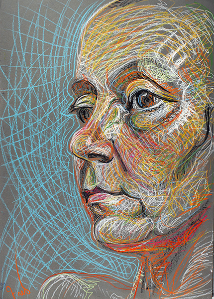
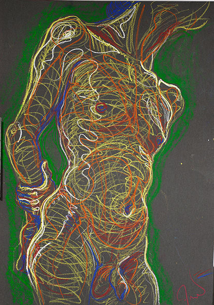
In figurative art, I’m always looking at the variations in flesh tones.  I find it useful to look at these very subtle differences as tendencies along axes of complementary colors:  orange/blue, magenta/green, red/green blue, yellow/deep blue.

Eight part color arrangement, digital illustration by Fred Hatt

Some of the illustrations in this post are my own, and others are found on the web.  Clicking on found images links to the site where I found them. For the Munsell colors used in some of the digital illustrations I am indebted to Wallkill Color for their Munsell Conversion Software.

Older Posts »

Powered by WordPress

Theme Tweaker by Unreal