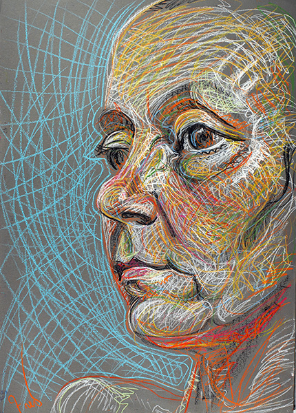
Clear Sight, 2007, by Fred Hatt
Artists who work from direct observation have a special way of looking at their subjects, a darting glance that picks up impressions the way a janitor’s litter spike snags trash. Nearly every action that builds up the drawing or painting follows from one of those quick looks. You look and make a mark, look again to refine the mark, look again to find the spatial relation of this to that, look for angles, look for curves, look for shades and colors, look to compare, look to correct. You’re constantly comparing your sketch to your model, translating perceptions into marks, trying to see better and capture better all the time, and racing the clock. In a classroom full of artists of mixed levels of experience, you can pick out the ones that know what they’re doing by watching how they look: how efficient and focused is their glance, and how frequently they look between their paper and the model.
My friend and fellow figurative artist Karen Miles made a little film about this (email subscribers will need to follow this link to view the film on YouTube):
These artists are drawing at Minerva Durham’s Spring Studio in New York, a drawing studio that attracts the most dedicated practitioners of drawing from the live model. If you were to observe a drawing session at Spring Studio, you’d probably be struck first by the quiet intensity of the whole group of artists. There is no music, no talking, just the single-minded focus on seeing and drawing.
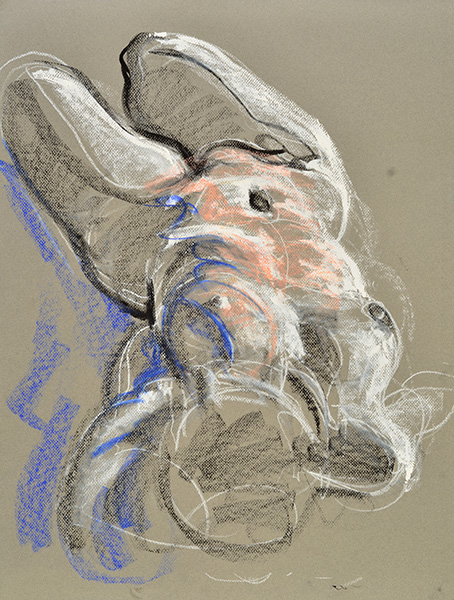
Crouch, 2009, by Fred Hatt
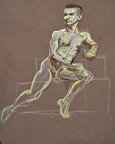
In quick poses my glances are looking for overall forms, trying to see the figure as an arrangement of curves in space.

On One Knee, 2013, by Fred Hatt
In the crayon drawing above, I made a first rough pass in magenta, then refined my contours in a bolder blue. There was probably a glance for nearly every separate stroke in the drawing. The sketch below is done with a brush and black watercolor. The individual strokes are easier to distinguish here. I see the curve of the shoulder and that becomes a brush stroke, then glance at the breast and make that curve, then at the belly and make that curve, and so on. Each marking has a certain rhythm and motion that reflect a quick tracing of that particular contour in my perceptual system.

Music, 2013, by Fred Hatt
Quite apart from the act of drawing, the normal visual process works by assembling impressions picked up by quick movements of the eyes called saccades. The eyes only see clearly over a narrow angle; the overall sharp photographic image we think we see is constructed in the brain as the fragmentary impressions of the saccades are knitted together. (Here’s a more detailed blog post about how that works.)
Complementary Poses, 2012, by Fred Hatt
Constant practice improves the speed by which we receive such perceptions. Each moment of seeing is translated into a movement of the hand. The resulting marks reflect the quality of these movements, and thereby trace a record of the act of vision, a series of impressions made as the artist experiences them.

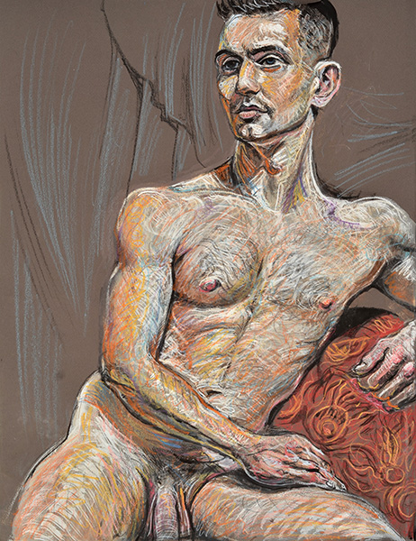
Passion, 2003, by Fred Hatt
Drawing is not simply a copying of contours, but a trail left in permanent marks as the mind examines a scene over a particular period of time. Seen this way, it is clear that drawing captures something that photography does not. A camera, like an NSA surveillance program, indiscriminately vacuums up every detail of light information in its range. A drawing artist is more like a murder-mystery detective, following all the trails, picking up clues, details, impressions, until a coherent picture emerges from the process. Photography is a mechanical scan, while drawing is an active, responsive exploration of a scene. The distinction is between intelligence gathering and intelligent gathering.

Corner, 2008, by Fred Hatt
The drawing medium affects how I see. When I am holding a pencil, as in the sketch above, I see the scene in terms of lines. When I use a fan brush, as below, I see broader strokes of light and shadow revealing the form in space.
Folding Forward, 2013, by Fred Hatt
I look for curves, and I look for angles. The form is constructed of flowing, rhythmic curves. The spatial arrangement of those curves is defined by angular connections.

Hands on Sacrum, 2013, by Fred Hatt
In drawing with a linear medium such as crayon or pencil, light, shade and color must all be translated into line. I imagine that I am drawing, not on flat paper, but directly on the body itself, so that every line follows the three-dimensional shape of the body. Notice the white serpentine line running from armpit to hip in the torso study below. It represents the center of a highlighted area, but its meandering reveals the subtle irregularities imparted to the surface of the skin by underlying layers of bone and muscle, as a raindrop snaking down a windshield shows the hidden undulations in seemingly smooth glass.
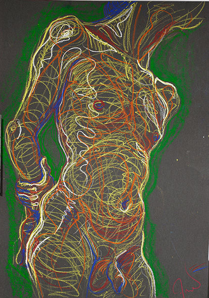
Lines of Energy on a Torso, 2006, by Fred Hatt
Every glance is a fragment of perceiving. Every glance becomes a stroke in the drawing. It is a living process to record the phenomenon of life.

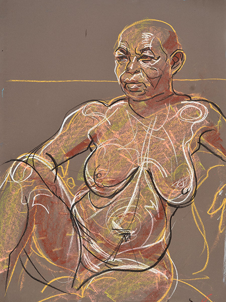
Imagining, 2008, by Fred Hatt
When there is more time to develop a drawing, additional layers of perceptions build up as the artist looks at the subject again and again. Light, shade, color, reflection, absorption, space, energy, temperature, texture, gravity, vibration, growth and decay – all the phenomena of matter and of life can be found by looking and looking some more.

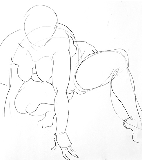
Legs, 2009, by Fred Hatt
Color and light in the real world are complex and slippery. Capturing such things is not a matter of simply duplicating a surface hue and value. Everything is relative, so everything must be seen relative to other things in the scene. As the work develops, the glances are comparative. What areas are redder than their neighboring areas? What areas are greener?

Back Light, 2013, by Fred Hatt
A body exists in space, and the image in the drawing becomes more real as it develops a sense of space. Further glances look at the parts of the body as they intersect with elements of the background.
In a Room, 2013, by Fred Hatt
I keep glancing, looking at light that reflects into shadows and light that penetrates the translucent skin and emerges tinged and diffused, looking at creases that swallow light and bulges that create specular highlights and gradients.
Side Arc, 2013, by Fred Hatt
To draw is to see seeing, that is, to experience in action all the processes that go into visual perception.

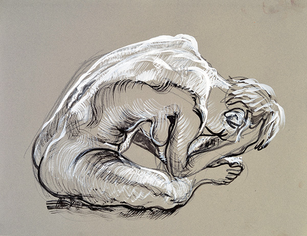
Prone, Crossed Ankles, 2013, by Fred Hatt


