DRAWING LIFE by fred hatt

2013/05/26

Life Drawing at ADaPT


Sample works by visual artists participating in the ADaPT Festival Life Drawing Score, clockwise from left: Michael Alan, Jillian Bernstein, KIMCHIKIM, Masha Braslavsky, Fred Hatt, Susan M. Berkowitz, IURRO.

Sample works by visual artists participating in the ADaPT Festival Life Drawing Score, clockwise from left: Michael Alan, Jillian Bernstein, KIMCHIKIM, Masha Braslavsky, Fred Hatt, Susan M. Berkowitz, IURRO.

ADaPT (A Dance and Physical Theater) Festival, founded in 2011, hosts performances, master classes, and other events in its home base of Santa Barbara, California, and in locations around the world, including one on May 30, 2013 at CPR (Center for Performance Research) in Brooklyn. Festival director Misa Kelly is a dancer and choreographer with her company ArtBark International, and she’s also a life drawing artist and model – please click that last link to see some of Misa’s wonderful drawings.

Adapt Festival Program Orson, May 30 at CPR, features twelve performances by a diverse artists – the link has a full list and descriptions of the pieces. Misa’s a maximalist, surrounding her performance events with installations, projections and opportunities for audience members to express their own creativity. For this program, she asked me to recruit some visual artists and to act as monitor for a special “Life Drawing Score” in conjunction with the performance program.

Art modeling/life drawing is a form of performance, a creative interaction between models (many of whom are also performers in other contexts) and visual artists. This interaction is rarely seen outside of the small community of artists and models. Artwork may be exhibited, but the art audience may be unaware of the collaborative nature of artists’ work with models. Likewise, the dance and theater audience may not know that the performers’ experience modeling for artists is a vital part of their performance practice. Misa decided this special creative relationship deserved a place in a festival of dance and physical theater.

Misa Kelly, photo by Am Wu

Misa Kelly, photo by Am Wu

Here’s what will happen on May 30:

Invited visual artists will be having a private life drawing session in the performance space starting at 6 pm. I’ll be the session monitor. Our models will be Misa Kelly and one other dancer. (There will be no audience for this, until the last 20 minutes of it.)

At 7:15 the audience is invited to the Pre-Show in the lobby. There will be a video installation, sage smudging, and various activities intended to engage audience members to express their own creativity through writing, drawing, and moving.

At 7:35 the audience members will be allowed into the performance space to witness and/or participate in the last 20 minutes of the life drawing session.

At 8:05 there will be a full program of twelve dance and physical theater performances in the performance space. There are descriptions of all of these pieces here: ADaPT Festival Program Orson.

At the intermission (around 9:00) the audience will return to the lobby to see an informal exhibition of work created during the earlier private life drawing session.

Location: CPR (Center for Performance Research), 361 Manhattan Ave, Brooklyn, NY. Tickets $10 in advance or $15 at the door.

Links for participating artists and models:

IURRO

Jillian Bernstein

KIMCHIKIM

Masha Braslavsky

Michael Alan

Misa Kelly

Susan M. Berkowitz

2013/03/12

Rough and Refined Versions


Sh About to Rise, 2013, by Fred Hatt, details of sketch and final version side-by-side

Sh About to Rise, 2013, by Fred Hatt, details of sketch and final version side-by-side

The first post of Drawing Life was published on March 15, 2009, so the fourth blogaversary is upon us. I want to thank my readers, those that have been following since the start and those that have recently discovered the blog, those that subscribe by email and those that just check it out a few times a year. I just can’t help producing a constant flow of images – it’s my nature – but looking at the site stats and seeing how many people look in on what I post here, and especially receiving comments, motivates me to keep sharing with you through this forum. I invite you, dear reader, to tell me what you’d like to see more of here, questions you’ve wanted to ask me, or topics you think I should address. Please comment.

Some readers are mainly interested in figure drawing and art technique, some are interested in body art, others respond most strongly to the photographic visual essays, and still others to the art-historical surveys. For me, it’s all of a piece, all about my approach to visual art as a practice of self-development – a journey I have chosen as the central journey of my life, an effort to transform perception and a quest for mastery in an open-ended craft.

I long ago discovered that I needed a core practice, a strong trellis upon which to cultivate my twisty vines. For me, that core practice is figure drawing. It provides me with an ideal combination of discipline and inspiration, self-measurement and freedom to explore. Looking back over the last six months of posts on Drawing Life I noticed it’s been a long time since I just posted an update on my recent figure drawing work, and I’ve built up quite an archive of unposted work in the past year – enough to explore various themes in separate posts.

In my figure drawing practice I attend two regular weekly sessions, one of which (at Figureworks) consists of poses two minutes to twenty minutes in length, and the other of which (at Spring Studio) includes a single longer pose. Total drawing time on that pose, subtracting breaks, amounts to about two hours. It’s enough time to do a fairly refined drawing, though I approach it differently at different times, sometimes focusing on capturing a likeness, sometimes looking at subtleties of color or shading, sometimes studying the relationship of the face to the body or of the model to the surroundings, or any combination of these things. Sometimes I get off to a solid start and keep working on one sheet of paper for the whole duration of the pose. Other times I do a sketch and then start over again for one reason or another. This post is a collection of recent pairs of rough, sketchy versions and more finished versions of the same poses. It’s a way of looking into my process.  For each pair, my commentary will be inserted between the sketchy and polished versions.

Ch Diagonal, sketch version, 2012, by Fred Hatt

Ch Diagonal, sketch version, 2012, by Fred Hatt

Often I start out studying the whole figure and then decide to focus on a cropped view. This pose has a strong diagonal through-line, from right foot to head, with the model’s left limbs acting as right-angled buttresses.  After doing the sketch above, I decided I wanted to work larger to get more detail in the face, realizing that the diagonal tilt of the body worked in the composition without having to go all the way down to the right foot. In this case, the sketch was weak, but doing it helped to sharpen my perception for the more developed drawing.

Ch Diagonal, final version, 2012, by Fred Hatt

Ch Diagonal, final version, 2012, by Fred Hatt

Sage, sketch version, 2012, by Fred Hatt

Here I felt the initial sketch was, in its rough form, a superb realization of my way of analyzing the figure, using curved lines to trace continuities of form, light, and body energy.  Further developing the drawing above would have obscured the white energy lines, destroying a drawing that is simple and intense. In this case I stopped, not because the sketch was weak or flawed, but because it was excellent in its undeveloped form. I went on to do the study below, applying most of my attention to the model’s face as an image of strong character and lived experience. I’m glad I stopped and saved the above version as a separate drawing, because it shows the robust, vibrant energy of the model’s abdomen, something that the second drawing omits.

Sage, final version, 2012, by Fred Hatt

Sage, final version, 2012, by Fred Hatt

B with Mannequins, sketch version, 2012, by Fred Hatt

B with Mannequins, sketch version, 2012, by Fred Hatt

This is a wonderful model I’ve drawn many times before. For this pose, she set up an array of background elements and I decided to place her in this spatial context, with the blocks and boxes, hanging fabrics, and tattooed mannequin parts around her. In my initial sketch, above, I tried to get everything in the frame.  Later, I decided to develop the drawing with the model more centered, omitting details on the left. But there’s something almost Matissean about the stripped-down, off-center composition of the rough sketch.

B with Mannequins, final version, 2012, by Fred Hatt

B with Mannequins, final version, 2012, by Fred Hatt

M with Stockings, sketch version, 2013, by Fred Hatt

M with Stockings, sketch version, 2013, by Fred Hatt

This model, a fine artist in her own right, has the artist’s sense of what will make an interesting pose. She came up with this Schiele-esque pose, angular, fascinatingly awkward, casual and odd, with one stocking on and one hanging from the hands. This kind of pose is complicated and not easy to draw. I studied it in the above sketch for several layers of light and dark forms, angles and curves and cut facets, before attempting the realistic/impressionistic monochrome rendering, below.

M with Stockings, final version, 2013, by Fred Hatt

M with Stockings, final version, 2013, by Fred Hatt

Cl Physique, sketch version, 2012, by Fred Hatt

Cl Physique, sketch version, 2012, by Fred Hatt

This model is a bodybuilder with incredibly defined muscles, and drawing him is an anatomical study. My initial sketch was an attempt to understand the pose, but I was craving more detail in the face and torso, and decided to develop the drawing in a vertical frame rather than the horizontal one with which I’d begun. This was a session I had to leave early because of a work obligation, so the second drawing here is less refined than some of the others in this post.

Cl Physique, final version, 2012, by Fred Hatt

Cl Physique, final version, 2012, by Fred Hatt

Sh About to Rise, sketch version, 2013, by Fred Hatt

Sh About to Rise, sketch version, 2013, by Fred Hatt

Here’s another one where the sketch was too good to ruin by developing it, and I felt the model’s face needed more space to show its character. These two drawings need to be seen together. The sketch above shows the character of the body, and the sketch below shows more detail in the character of the face. There’s a limit to the paper size that can be used n the context of the crowded group session. Sometimes I wish I could draw everything in life size.

Sh About to Rise, final version, 2013, by Fred Hatt

Sh About to Rise, final version, 2013, by Fred Hatt

Reclining K from Head End, sketch version, 2013, by Fred Hatt

Reclining K from Head End, sketch version, 2013, by Fred Hatt

This pair is done in my studio, not in the Monday morning long-pose session at Spring Studio, as are all the other examples in this post. Recently I’ve had an opportunity to work with the same model almost weekly in my own studio. I expect there will eventually be a post here about this experience. In my own studio I can work with dramatic lighting that is not practical in the group setting of Spring Studio, and can work directly with the model to refine the poses. After doing the rough crayon and gouache sketch above, the pose was modified to paint the foreshortened view below.

Reclining K from Head End, final version, 2013, by Fred Hatt

Reclining K from Head End, final version, 2013, by Fred Hatt

All of the original drawings shown in this post are roughly 19″ x 25″ (48 c 64 cm). Some are drawn with Caran d’Ache aqruarelle crayons alone, and some are painted in gouache, combined with the crayons.

2013/01/25

Working Big – Part 2: Weaving with Bodies

Explorer, 2010, by Fred Hatt

Explorer, 2010, aquarelle crayon on black gessoed canvas, 72″ x 72″, by Fred Hatt

In last month’s post, “Working Big – Part 1”, I shared a selection of large figure drawings done at or near life-size. Over the last decade I’ve also been doing large-scale drawings with multiple overlapping figures.

In the Drawing Life post “Time and Line”, I wrote about how I arrived at this approach, and how it relates to my earliest creative impulses. I wrote:

The cubists were trying to move beyond the limitations of the pictorial or photographic view by showing their subject from multiple angles simultaneously, suggesting the third spatial dimension not by the traditional way of projection or perspective, but by fragmentation. In these drawings, I’m fragmenting the fourth dimension, time, to bring it onto the plane and into the frame.

On my portfolio site I describe these drawings as “chaos compositions”, and briefly describe the process as follows:

Chaos Compositions emerge from a two-phase process: first generating a chaotic field through a response to movement, followed by working to reveal order hidden within this chaos.

I work on the floor, crawling over the large sheet and covering it with overlapping sketches of movement or quick poses taken by a model-collaborator. Once the drawing reaches a certain density, like a tangle of threads, I begin to work on carving a structure out of this undifferentiated energy field. I bring some of the layers of drawing forward by adding depth and weight to the forms, and push others into the background or into abstraction. I alternate between crawling on the drawing, where individual lines can be followed like paths, and standing back to get a sense of overall form and balance.

What is expressed in these works is not a concept or a personal feeling, but something unconceived, a spirit that emerges from the moment, from the interaction of artist and model and environment.

Several chaos compositions are included in the gallery “Time and Motion Drawings” on my portfolio site.

Still more posts about this process are linked in connection with some of the drawings below. As you can see, I’ve written fairly extensively about this way of working, and you can follow those links to read all about it if you wish. Here I’ll just share a selection of these pieces, with some unstructured thoughts about what these odd drawings mean to me.

End in Ice, 2012, by Fred Hatt

End in Ice, 2012, watercolor on paper, 38″ x 50″, by Fred Hatt

Each model embodies a certain particular essence, a range of qualities that express the way his or her self and structure exist in the world.

Follower, 2006, by Fred Hatt

Follower, 2006, aquarelle crayon on black gessoed canvas, 72″ x 72″, by Fred Hatt

The curves of the body in all its different attitudes become waves in a field of energy. My drawing surface becomes a sensitive membrane that receives these vibrations.

Colt, 2011, by Fred Hatt

Colt, 2011, aquarelle crayon on paper, 37″ x 48″, by Fred Hatt

Each piece is a portrait of one model. These are not different bodies sharing a setting, but different moments exposed on the same emulsion.

Ruminate, 2011, by Fred Hatt

Ruminate, 2011, aquarelle crayon on paper, 36″ x 60″, by Fred Hatt

To look at these drawings is not to look at a picture, but to fall into a vortex, a field of chaotic forces.

Biome, 2011, by Fred Hatt

Biome, 2011, aquarelle crayon on paper, 37″ x 48″, by Fred Hatt

By finding and following the lines that define the overlapping bodies and faces, we find our way through the maze of the drawing. For me this experience is metaphorical, for in the field of forces that is the world, it is our own bodies and identities that ground us and give us continuity.

Contain, 2011, by Fred Hatt

Contain, 2011, aquarelle crayon on paper, 36″ x 66″, by Fred Hatt

I want the viewer of these drawings to get some flavor of the experience I have when drawing them, an experience of surrendering to complexity but discovering clarity in the body and its life force.

Verso, 2008, by Fred Hatt

Verso, 2008, aquarelle crayon on paper, 48″ x 60″, by Fred Hatt

The chaotic nature of the world is inherent to its beauty. Geological and biological forms, clouds and galaxies, grow out of the infinite complexity of interacting energies and interdependent beings.

Hold, 2011, by Fred Hatt

Hold, 2011, aquarelle crayon on paper, 37″ x 48″, by Fred Hatt

To grasp the universe is to lose the self in the moment. It is an experience I seek again and again, with a crayon in my hand.

Twists, 2010, by Fred Hatt

Twists, 2010, aquarelle crayon on paper, 48″ x 50″, by Fred Hatt

(The image above is deconstructed into its component figures in the post “Reverse Engineering a Drawing”)

Awakening, 2011, by Fred Hatt

Awakening, 2011, aquarelle crayon on paper, 37″ x 48″, by Fred Hatt

I don’t tell my models how to move, but let them find their own poses. I am not concerned with realistic rendering, but with the qualities of the curves and the forms of energy they seem to call up from the potent void of negative space. I am attempting to see beyond the surface of things.

Hero, 2010, by Fred Hatt

Hero, 2010, aquarelle crayon on paper, 48″ x 60″, by Fred Hatt

(The drawing above is included in the post  “Finishing Touches”, where I explore the development of the negative spaces in several chaos compositions.)

Water Cycle, 2011, by Fred Hatt

Water Cycle, 2011, aquarelle crayon on paper, 37″ x 48″, by Fred Hatt

When I am drawing, I am close to the large paper and cannot see the overall pattern. I am down in it, exploring whatever passage I have found for the moment. Later, looking at the drawing from a distance, I see it abstractly, as veins of color in a crystal, or as objects in a whirlwind. Then the eye discovers a face or part of a body, and that is an opening into the image, which can be traveled like a path through the woods, or like a strand of thought through the din of the chattering mind.

Gaze Angle, 2009, by Fred Hatt

Gaze Angle, 2009, aquarelle crayon on paper, 48″ x 60″, by Fred Hatt

(The phases of development of the piece above are detailed in the post “Composing on the Fly”.)

End in Fire, 2012, by Fred Hatt

End in Fire, 2012, watercolor, oil pastel, and aquarelle crayon on paper, 38″ x 50″, by Fred Hatt

These works, even more than my other drawings, are products of close collaboration with great models who share their own creative expression in the work. The models who posed for the large drawings in this post are Kuan, Pedro, Stephanie, Jillian, Madelyn, Neil, Milvia, Jeremiah, Kristin, and Jessi.

2012/12/19

Working Big – Part 1


Nocturne, 2009, 48″ x 60″, by Fred Hatt

Many figurative artists carry on an ongoing practice in group life drawing sessions, as I do, but when they have a chance to work with a model in their own studio, they choose to do work that is much more planned, composed, and developed.  I tend to get less planned and more experimental when I work in my own studio.  It provides an opportunity for spontaneity and direct creative collaboration with the model that just isn’t possible in the group setting, and above all, it makes it possible to work on a bigger scale.  In a classroom shared with other artists, it just wouldn’t do for me to take over half the floor with an enormous drawing.

The crayon drawing above, like all the other large scale drawings in this post, was made without planning or preliminary sketches, going directly to work on a four by five foot sheet of black paper, and the figure is approximately life-size.  (The model is Museworthy‘s Claudia.)  This way of working doesn’t guarantee a good result – in fact, there’s a high failure rate.  The real disasters won’t be shared here.  When it does work, though, the resulting drawings can have a lively quality that too much thinking and planning tends to stifle.

In quick sketching, working much smaller, my way of approximating proportions is to rely on the rhythm of the movements of the hand.  A torso, for example, might be thought of as a musical measure, consisting of a quarter note for the curve of the breast, a series of sixteenth notes for the ribs, and a half note for the abdomen.  (That’s an explanatory metaphor – in practice I never think of visual rhythms in quite such precise terms.)  The smaller the drawing gets, the more difficult it is to use this rhythmic sense, because the movements used to make the lines become so small.  It is easier to feel the fluctuations of movement with the forearm than it is with the fingers, and it is easier still with the whole arm and shoulder.  Sometimes, as in the sketchbook page below, I try shifting the scale of my sketches as an exercise, and for me, working small is challenging!

fredhatt-2012-michael-quick-poses

Michael quick poses, 2012, 17″ x 14″, by Fred Hatt

I’ve done many portraits around twice life-size.  The human face is a complex cluster of forms, and when the drawing or painting is small, we are forced to simplify by the bluntness of our instruments.  You just can’t facet a diamond with a sledgehammer.  Upsizing the subject makes it possible to capture much more meaningful detail with our clumsy fingers and dull tools.

fredhatt-2011-marilyn

Marilyn, 2011, 19″ x 25″, by Fred Hatt

The remainder of this post consists of large scale figure drawings made in my own studio on papers ranging in size from about 30″ x 48″ (76 x 122 cm) to 60″ x 60″ (152 x 152 cm).  In past posts I’ve found that these large drawings, especially the complex ones with multiple overlapping figures, lose a lot of their impact and even legibility at the size I use for pictures on the blog.  I’ve made these images slightly larger than what I usually use here, but I haven’t made them much larger because I don’t want to give away online pictures of sufficiently high resolution to let someone make book-quality prints.  I hope these reproductions will give you a sense of what the originals are like, and if you want to see them in their full glory, you’ll have to visit my studio or an exhibit of my work!

Feet, 2007, by Fred Hatt

Feet, 2007, 48″ x 60″, by Fred Hatt

I often make my larger work in pairs.  The larger-than-life-scale crayon drawings above and below were done in the same session.  Both are 48″ x 60″.  These are on my portfolio site, and the digital images have been popular recently on Tumblr and Pinterest.

Back and Hand, 2007, by Fred Hatt

Back and Hand, 2007, 48″ x 60″, by Fred Hatt

You might think it would be hard to maintain proportions, painting in watercolors directly from life, without preliminary measurements or sketches, on a piece of paper too large to see all at once from working distance.  In fact, when making the figures smaller than life-size, proportion has been a problem for me.  It gets much easier when the figures are life-size, since I have a very good sense of how long an arm is, how big a hand is, and so on.

Mountain and Valley, 2012, by Fred Hatt

Mountain and Valley, 2012, 38″ x 50″, by Fred Hatt

Since I’m working directly from life, and I like the models to take interesting poses that might be challenging to hold over a long period of time, I try to work very quickly.  These are essentially quick sketches, not so different from what I’d do on a much smaller piece of paper in twenty minutes or so, and they have all the roughness that implies.  We’re not used to seeing the scribbly techniques of the quick sketch at this scale.

Towering, 2012, by Fred Hatt

Towering, 2012, 38″ x 50″, by Fred Hatt

The drawing above was made by observing through a mirror placed on the floor, to see the figure as though from beneath.  Of course this means the drawing was done upside down.

Spinal Curves, 2012, by Fred Hatt

Spinal Curves, 2012, 38″ x 50″, by Fred Hatt

Most artists doing observational work at large scale use an easel, but paper or canvas of this size mounted on an easel would be like a wall between the artist and the model.  For me it’s important to have open space between myself and the model, with no energetic barriers, so I do all of these big drawings on the floor.

Waxing Moon, 2010, by Fred Hatt

Waxing Moon, 2010, 48″ x 30″, by Fred Hatt

The pair above and below are done in aquarelle crayon on black paper.  Each piece is 48″ x 30″ – the smallest pieces in this post, besides the portrait and quick sketch examples seen near the top.  These drawings were featured in an earlier post, two years ago.

Waning Moon, 2009, by Fred Hatt

Waning Moon, 2009, 48″ x 30″, by Fred Hatt

In the next pair, I’m trying to get the kind of bodily expressiveness Rodin mastered in sculpture, using direct, no-sketch watercolor painting and life-size scaling, and working with exquisite dancer-models.

Melting Glacier, 2012, by Fred Hatt

Melting Glacier, 2012, 38″ x 50″, by Fred Hatt

Thawing Permafrost, 2012, by Fred Hatt

Thawing Permafrost, 2012, 38″ x 50″, by Fred Hatt

Since I’m working on the floor, I tend to favor reclining poses, as I can see the pose while crawling on top of the drawing paper, without craning my neck.  I love these unusual foreshortened views of the body, and I feel that the view of the head from above has a special subjective quality – it suggests the face we feel from within, rather than the face we present to the world.

Cool Down, 2003, 60" x 60", by Fred Hatt

Cool Down, 2003, 60″ x 60″, by Fred Hatt

Many of my large-scale figure drawings feature multiple, overlapping figures of the same model, incorporating the temporal dimension into the composition.  You can see many examples here,  and posts about the process here and here and here and  here, and those drawings will be the subject of “Working Big, Part 2”, to be posted in about a month.

Double Exposure, 2007, by Fred Hatt

Double Exposure, 2007, 30″ x 60″, by Fred Hatt

Thanks to my great model/collaborators for these drawings:  Claudia, Izaskun, Jeremiah, Kristin, Kuan, Pedro, and Yuko.

My work is included in the exhibit Faces of Figureworks: Self Portraits, January 5 – March 3 at Figureworks Gallery in Brooklyn, with an opening reception Friday, January 11.  I’ll post further details here soon.  If you’re in NYC, come see me!

2012/11/09

White & Black on Gray

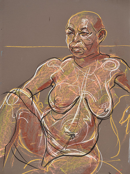
Ben, 2012, gouache by Fred Hatt

It’s a classic drawing technique used by figurative masters like Albrecht Dürer and Pierre-Paul Prud’hon (see beautiful examples by both artists at the links) – work on a gray or mid-toned paper or ground, draw highlights in white and shadows in black, and you efficiently produce a full range of values.  If you work on white paper, on the other hand, you are starting from one extreme and have to construct the whole scale going in one direction, which turns out to be difficult and time consuming.  Most of the values we see in a real-life scene are closer to middle gray than they are to pure white or black.  Starting from a gray ground isn’t just a more efficient way to draw, it’s a more subtle way to observe.  You see the variations in relation to the average, noticing the brightest highlights and the darkest shadows, then looking for areas that are a bit lighter or a bit darker than their surroundings.

When I first started attending life drawing sessions as a regular practice, back in the mid-1990’s, I quickly realized that speed is of the essence in both observing and marking.  The timer is always running, and the model can only hold the pose for a limited time, and the more interesting is the pose, the more limited is the time.  So I want to draw as much as I can as quickly as possible, and the gray paper technique is amazingly swift.  In this post I’ll share a variety of my figure drawings and paintings using variations of this technique in its monochrome mode, with observations that may be of interest if you draw or paint or are interested in the process of observational art.  Some aspects of my technique may be more evident in the absence of color.

Reclining Male, 1995, Conté crayon by Fred Hatt

It doesn’t really matter what order you do things in.  Sometimes I start with contour lines, then add some shading, then pick up the highlights. If the highlights are lightened, the gray ground can represent a basic shadow.

Man and Shadow, 1996, Conté crayon by Fred Hatt

Sometimes I do a rough sketch with a colored crayon to figure out the overall structure, then use white to capture where the light falls on the subject, and black to deepen the crevices and the darkest part of the shadowy areas.

Reclining Curves, 1997, aquarelle crayon by Fred Hatt

I tend to prefer media like inks and crayons that don’t really blend, rather than ones like oil paint that blend easily.  The strokes of the pen or brush capture the energy of the process, and I don’t want those strokes to be lost in the smear of smoothness.  I try to make all the marks follow the three-dimensional contours as though they are moving over the surface of the subject.

Rudy, 1997, ink and gouache by Fred Hatt

It is light and shadow that make an image jump off the page.  The artist works out the structure of the image as it is projected onto a flat surface, but when light and shadow are added, the sketch is elevated to an illusion.

Head and Torso, 1998, aquarelle crayon by Fred Hatt

I often use color for the structural analysis phase of the sketch, working loosely, feeling proportion by the rhythmic progression of curves and the angular relationships of masses.  Then light and shade are added to make it all look solid.

Analysis of Reclining Figure, 2001, aquarelle crayon by Fred Hatt

Light adds the third dimension to an image because it adds another directional aspect.  A line drawing of contours as seen from the observer’s angle is just shapes on a flat surface.  When we add light and shadow, we add another point of view.  The light illuminates certain surfaces and not others because it is coming from an angle different from the observer’s line of sight.  The paper plane, the sight line, and the light line are dimensions of pictorial seeing, just as the X, Y, and Z axis are the mathematical dimensions defining a three-dimensional space or form.

Erik Inverted, 2001, aquarelle crayon by Fred Hatt

For me, the highlight areas usually reveal more form than the shadowy areas.  Sometimes I just dance all over the highlighted surfaces with white lines, staying very loose but always following the form.

Estella, 2001, aquarelle crayon by Fred Hatt

I try to keep my hand movement as free as possible, but the observations guiding them as clear and precise as possible.

George, 2001, aquarelle crayon by Fred Hatt

I am focused on light and shadow and form, but I want to let character and the quality of aliveness emerge from the process.

Arnold, 2002, aquarelle crayon by Fred Hatt

Hand on Thigh, 2002, aquarelle crayon by Fred Hatt

The human form is a complex arrangement of tension and impulse, layers of hard and soft and wiry and fluid.  There will always be much more there than you can capture with your eye and hand, but if you really go at it like a mad scientist you might get some of the feel of it in your sketch.

Inverted Torso, 2002, aquarelle crayon by Fred Hatt

While the highlights reveal more of the subtle shapes of the surfaces, the dark lines define the most salient edges, the deep grooves, the biometric landmarks.

Yisroel, 2002, aquarelle crayon by Fred Hatt

Sometimes I separate these aspects and repeat them, doing highlights or shadows now as lines, now as cloudy forms.

Studies of Robert, 2005, aquarelle crayon by Fred Hatt

Like color, the perception of values of light and dark is relativistic – every value is seen as lighter or darker in relation to its surroundings.  Starting with a gray ground allows us to draw relativistically, looking at every area in comparison to its surrounding average.  We let the gray ground be that local average, and use white and black to mark the local differences.

Andrew, 2006, aquarelle crayon by Fred Hatt

Much of my work is colorful, but if you ask me to name my favorite color, it will have to be gray.  Gray is the magical middle way, the point of balance, the axis, the mutable mean.  Holding the center maximizes freedom of movement.

Betty, 2010, aquarelle crayon by Fred Hatt

Light defines some aspects of a scene, and darkness defines other aspects.  Gray is the neutral ground, the zero that defines both positive and negative.

Model and Artist, 2010, aquarelle crayon by Fred Hatt

For many years I drew mostly with aquarelle crayons.  In the past year I’ve been experimenting more with gouache and watercolor paints, and sometimes combining these media with the crayons.  Rather than blending the paint, I tend to use fan brushes and cross-hatching techniques to add black to white, white to black, or either to gray.

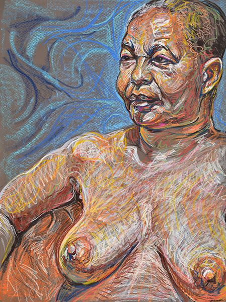
Ben (detail), 2012, gouache by Fred Hatt

Above is a detail of the portrait that heads this post, a portrait drawn in about two hours in the session I supervise at Spring Studio.  Below is a larger-than-life scale portrait sketch made in a twenty minute pose in one of the figure drawing sessions at Figureworks Gallery in Brooklyn.  The technique is essentially the same, but the level of complexity is different.

Tinuola Profile, 2012, gouache by Fred Hatt

To translate light into line, I see light as a touch that strokes the figure, and I follow those strokes with my crayons and brushes.  White lines define the bright edges, and dark lines define the dark edges.  Scribbly strokes of white and black follow the subtler variations of tone.

Seated Back, 2012, gouache and aquarelle crayon by Fred Hatt

Here’s an attempt at a portrait of Claudia, the Museworthy blogger, from a session this past week at Spring Studio.  Claudia writes about art and life with a strong, engaging voice, shares a wide variety of great work, and gives a perspective on figurative art from the other side of the easel.

Claudia, 2012, gouache and aquarelle crayon by Fred Hatt

Sometimes I try to simplify lit areas into simple brush gestures with white paint.  The dark lines tend to define simpler, more straightforward contours anyway.  Reducing highlighted areas to white gestures brings dark and light into beautiful equilibrium.

Strength at Rest, 2012, gouache and aquarelle crayon by Fred Hatt

Part of the artistic prestige of sculpture and of traditional black-and-white silver halide photography comes from how discarding color can reveal the formal essence of an image.  This is Fly, an art model and artist of the “Peops” series of biographical portraits.

Fly, 2012, gouache and aquarelle crayon by Fred Hatt

Simplicity and formal clarity, and a highly efficient approach to observing and rendering.  White and black on gray.

Right Triangles, 2012, gouache and aquarelle crayon by Fred Hatt

All of the original drawings pictured in this post are in the range of 18″ x 24″ (46 x 61 cm) to 20″ x 28″ (50 x 70 cm).

« Newer PostsOlder Posts »

Powered by WordPress

Theme Tweaker by Unreal